One of the services I offer my clients is to print the invitations that they design. The first step is to schedule a consultation so that we can discuss your paper needs, printing wishes and budget. I can help guide you towards a successful result by recommending sizes, colors and other printing considerations that will ultimately get an invitation that is beautiful--of course, because it was designed by you!
This is an example of a recent project I worked on with clients Scott de Fasselle, a web and marketing designer for his own company Blitz Media Design, and his fiancée Kristin. Scott and I discussed the vision of the project along with the sizes and how to fit a letterpress invitation into their budget. The final result was a beautifully letterpress printed invitation and envelope, with the accommodations and reply insert printed by me using my in-house printer. We took advantage of the long sized invitation and put the reply postcard on the same piece of paper as the accommodations and map information. I perforated the reply card so it could be separated and mailed back, while the other information stayed in the hands of the guest.
Are you thinking about designing your own invitations? Let's talk!
Friday, December 31, 2010
Thursday, December 30, 2010
Want a creative photo booth at your event?
You may or may not know that I'm planning my own party. It's a 40th birthday party set for June and I've been intermittently obsessed with it --Margot? Obsessed? how strange ;o)--for about a year and a half. When life was too overwhelming for me the past few years, I would focus on it as a pinpoint of light at the end of a dark tunnel I was in. There were so many people who were hanging in there with me and I wanted to find a way to thank them and celebrate friendship and love.
The party has a tight budget but I wanted to have some key elements that create an atmosphere of fun and possibly silliness. I'm thinking that a custom photo booth would add that to the event so I've been on the look-out for one that is both pretty to look at and inviting to guests so they will actually participate. Today I found this picture and it's what I'm looking for! It was designed by Diane or "Miss Brache" (the blog moniker) for her wedding which had a vintage and quirky and colorful theme (you must view the pics of her wedding here, taken by Amber Sycz Photography--I love that soft aqua mixed with dark cherry red--gorgeous!). The rest of her DIY wedding is blogumented here which mentions how she decided her bridesmaid dress patterns and colors. You know I always like that design break-down!
Now I just have to figure out how I'm going to put this together. Any suggestions? 1/2" foamcore with a wood brace so it can stand up? I know that's Amy Butler fabric for the background. Time to start collecting vintage (or vintage looking) picture frames. There is a tutorial on how to set up your computer to do the work of the photo booth here. I'll be reading that one in detail! I'll keep you up on my progress. In the meantime if you know how to put this together, send me a linky please.
Wednesday, December 29, 2010
Pink and gold are "in"
Did I not call the pink and gold?? Didn't I?? It's nice when I'm with the fashion trends instead of chasing after them. I'm just sayin'....it's not often but it does happen sometimes.
I was playing around with pink and gold this fall and did a color palette post here and some event inspiration bits and pieces here and showed an actual party with the color scheme in this post. Honeysuckle was determined as is the Pantone Color of the Year.
Here is a beautiful outfit from JCrew that was featured this morning on the blog Say Yes to Hoboken. I love the pink shoes with the neutral gold balance. Yummy! I looked and looked for this specific photo on the JCrew website but couldn't find it. It's there somewhere...the model looks a bit like my kids during family photo time.
Tuesday, December 28, 2010
Inspiration board for Pantone's Color of the Year: Honeysuckle Pink
Making an on-line inspiration or style board is something you might want to try for your wedding or event preparations. I find that collecting images that revolve around a theme can be an effective way to "see" how your event will come together. The theme can be a color or palette of colors, an era (such as Victorian), a style (modern nature) or anything else that might bind your event together. Do some research on-line, google your theme (click on the "images" tab) to find inspiring images. I copy them into a folder on my desktop and make sure I use the name of the blog or website I found them on so I can go back to the source. This can help you make decisions with each aspect of your event if you tend to be easily distracted like me. In this example I did above, Honeysuckle pink is the theme. If you saw a black and gold invitation you saw and liked, you can place it into your inspiration board and see if it works for you. If not, you don't need to overstress about the decision anymore. Take it out and move forward.
Since I am highlighting Pantone's "Color of the Year" as mentioned in yesterday's post (here) I thought I would try the on-line style board tool on The Dessy Group's website which uses Pantone colors as it's foundation. You can choose your color or palette of Pantone colors and then find designer dresses, flower bouquets, shoes, accessories, invitations and more in that color. You can also upload your own images (from your own on-line research) as I did to broaden your planning to the possible favors, table accents, lighting, furniture and more. The Dessy Group's tool is fairly easy to use, with a few glitches (that bouquet on the left is supposed to be underneath the dress, but even though I told it to go under, it didn't, and I still can't figure out how to delete an image after I've placed it). Give it a try and show me what you do!
Credits for the board I used above (from left to right, top to bottom):
1. Invitation from The Wedding Paper Divas
2. Invitation from Margot Madison Creative
3. Tassel via The Dessy Group
4. Bouquet via The Dessy Group
5. Bouquet via The Dessy Group
6. Bridesmaid dress via The Dessy Group
7. Table number from Sophie's Favors
8. Macaron cookie from Magalerie
9. Pink tie via The Dessy Group
10. Pink bird tags from Astonishing Supplies
11. Pink glass punch cups from Katy Bits and Pieces
Monday, December 27, 2010
and the color of the year is....
Honeysuckle pink! So says Pantone, the color gurus of the universe. Here is what they have to say about it:
A Color for All Seasons
Courageous. Confident. Vital. A brave new color, for a brave new world. Let the bold spirit of Honeysuckle infuse you, lift you and carry you through the year. It’s a color for every day – with nothing “everyday” about it.
While the 2010 color of the year, PANTONE 15-5519 Turquoise, served as an escape for many, Honeysuckle emboldens us to face everyday troubles with verve and vigor. A dynamic reddish pink, Honeysuckle is encouraging and uplifting. It elevates our psyche beyond escape, instilling the confidence, courage and spirit to meet the exhaustive challenges that have become part of everyday life.
“In times of stress, we need something to lift our spirits. Honeysuckle is a captivating, stimulating color that gets the adrenaline going – perfect to ward off the blues,” explains Leatrice Eiseman, executive director of the Pantone Color Institute®. “Honeysuckle derives its positive qualities from a powerful bond to its mother color red, the most physical, viscerally alive hue in the spectrum.”
Eiseman continues, “The intensity of this festive reddish pink allures and engages. In fact, this color, not the sweet fragrance of the flower blossoms for which it was named, is what attracts hummingbirds to nectar. Honeysuckle may also bring a wave of nostalgia for its associated delicious scent reminiscent of the carefree days of spring and summer.”
Honeysuckle is guaranteed to produce a healthy glow when worn by both men and women. It’s a striking, eye-catching hue that works well for day and night in women’s apparel, accessories and cosmetics, and in men’s ties, shirts and sportswear. Add a lively flair to interior spaces with Honeysuckle patterned pillows, bedspreads, small appliances and tabletop accessories. Looking for an inexpensive way to perk up your home? Paint a wall in Honeysuckle for a dynamic burst of energy in the family room, kitchen or hallway.
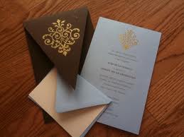
For those of you not familiar with Pantone, it is a color specification system that is used by art and fashion industries all over the world. It essentially, creates a color swatch (with it's own number) which can be used by designers for paint, fabric, ink and more. For instance, the red of my logo is PMS 187 so when I am printing, I can tell my printer this number and can be assured that the color I think it's going to be is the color I see in the final product. This works really well for your wedding or event planning. You can collect your palette of colors and pass them on to your vendors so your specific shade of celery green does not get interpreted by your bakery as mint green or chartreuse green etc.What do you think of this Honeysuckle pink?? I'm going to investigate it a little further with some inspiration boards today and see if I think it is really going to stimulate my adrenaline and ward off the blues better than an evening of True Blood. ;o)
Monday, December 20, 2010
Free Font website-Font Squirrel
Are you in need of fonts? Want to browse some for your invitation project? Here is another source for free fonts (free if used for non-commercial purposes). It's called Fontsquirrel. Take a gander!
You can browse fonts by style (script, handwritten, serif, san serif etc) and download them directly to your computer.
Thursday, December 16, 2010
Inspiration details for coffee with the Book Club
Moving right along with my next "event" styling, I've got some details put together to contemplate. The colors are primarily black and white with pops of rich color from my color inspiration posted earlier this week (link here.)
1. These are some bookplates I designed for this specific event. I plan on putting them together into a white sleeve and sewing or taping it closed (as in #5 in this collage). I'll be including this as a free printable for you later.
2. My beloved Black Fruit tea set (well, at the moment it's my mothers but it is part of my inheritance so I consider it mine even though it's residing at my parent's house) by Susie Cooper. More about her here.
3. This is an interesting Danish platter I saw on etsy from Vakvar.
4. A nice cake details from Maisie Fantaisie. I'm thinking about putting a pattern like this on some homemade shortbread cookies.
5. A nice little pack of Pretty Tape that I purchased this week in anticipation. Washi tape is one of my weaknesses and I impulse buy it constantly now.
6. A white pedestal cake stand I bought at Home Goods. Again, an impulse buy, but you can never have too many cake stands. Unless you run out of storage space (ahem, Karyn).
7. Multicolored cocktail napkins from Crate and Barrel. It's funny, I picked these up and put them down several times while browsing a few weeks ago in the store. Now of course I wish I had bought them. I should know better...
8. The back drop of this photo is a lovely piece of wallpaper from Nama Rococco.
There are also some neat shortbread cookies here, some cool black patterned glass plates here, and I'm intrigued by these cool upcycled envelopes. And here is a doily rubber stamp that would work with this theme too.
So, the only thing I haven't thought really hard about yet are flowers, or some kind of fresh floral arrangement. Any ideas? Send those and all other brainstorming ideas my way...
Wednesday, December 15, 2010
Tuesday, December 14, 2010
Inspiration for a party that is NOT FOR CHRISTMAS
I am so enjoying the holiday season this year! Of course since I am knee deep in christmas card orders, I'm daydreaming about what's next on the party agenda. And what's next is a coffee/book club party I'm designing in my head at the moment. Here is a little sneak peek into the color scheme, which is primarily black and white with some splashes of rich color. I was ultimately inspired by this coffee set of my mothers (I desperately want to inherit it since I'm totally in love with it!). She got it when she and my dad lived in England about, uh, 40 years ago I think. The designer is an English woman named Susie Cooper and this particular pattern is called Black Fruit from the late 1950's. When I showed my obsessiveness for it a few years back, my mother dutifully spent hours bidding on additional sets on ebay. I so love my Muthie.....
Anyway, here is the seed for the next "show". Isn't it so rich how the black and white drawing is so delicate and detailed and then it is contrasted by this rich flood of color on the inside of the cup. It's old and it's modern at the same time (my favorite design combo)*Stomach twirls* I love it so much!
Here are some more photos from that shoot. You should know that the amazing artwork in the back is a much loved sheet of wallpaper from Nama Rococco. I thought the black design with the organic hand painted colors complimented the tea set nicely, don't you think? And did you notice that I'm getting better at the f-stops? Hmmm? Somebody has been practicing hard on that....
Anyway, here is the seed for the next "show". Isn't it so rich how the black and white drawing is so delicate and detailed and then it is contrasted by this rich flood of color on the inside of the cup. It's old and it's modern at the same time (my favorite design combo)*Stomach twirls* I love it so much!
![]() |
| Color scheme using Susie Cooper's Black Fruit tea set |
Monday, December 13, 2010
"Yesterday, Today and Tomorrow" Creative Save the Dates
![]() |
| Yesterday, Today and Tomorrow Save the Date card |
Not everyone can be lucky enough to have known their future spouse when they were in high school. For some, that might be a good thing ;o). I actually knew my future husband in high school but had absolutely NO IDEA that we would end up married. It's even weird for me to think about all the parties I saw him at and never knew he'd be the sweet man by my side today. *sigh*
In some cases, two people have an idea that there was something special about that cool/cute guy/girl in their English class. They even went to a dance together. Maybe they went their separate ways through college but caught up with each other later
That's what happened with this darling couple. Claire and Joe went to a homecoming dance together when they were in high school, ultimately went their separate ways for a while and then found themselves together again after college. Sharing a bit of their past seemed a perfect way to announce their future wedding date so I created this Margot Madison original design for them. I must say that everytime I look at this announcement I smile. Look at how much they've NOT changed!! Isn't that so stinking cute?? I love it. And I love this part of my job; meeting people in the beginning of a wonderful journey together.
Did you know your spouse when you were young? Did you know right away that this person was "it"? Or did you not see the hidden jewel until later?
Friday, December 10, 2010
DIY Friday: How do you make a custom rubber stamp?
![]() |
| A custom rubber stamp I created |
![]() |
| Using my stamp on a disk of wood for a holiday tag |
I'm not talking about carving one yourself here. That's great if you want to and here is a nice tutorial for that from one of my favorite artists.
I'm talking about how to send custom artwork to a rubber stamp company. It's a great idea for personalizing many aspects of your wedding or event. You can do a special return address for your envelopes, custom artwork from clipart you've found to integrate into your wedding, a monogram or just a fun design that you created to add spark to your favors, tags, host cards etc.
It's really quite easy to do. You need black and white "artwork" (this can be anything from a drawing to a monogram). Make sure your art does not have any gray or screens of color in it. Only solid black and white lines or areas will work, and take care to watch out for very thin lines (which might not "hold" when the stamp is created) or lines which are close together because they might clog up with ink and make for a muddled look.
I'll take you through one of my most recent projects with a custom stamp.
First, I drew my design on white paper with a black ink pen. After looking at it, I adjusted the lines to be thicker. Then I scanned it into my computer with the Black and White/Bitmap setting. I suggest keeping the resolution at 300 dpi for the finest quality in detail. You can also create the design in your computer (using your fonts etc. in the design). I just checked how to do it in my Word program and it looks like your would do this: File--> Save As--> .pdf format. Other programs allow you to "export" the image into the correct formats. Save the file as a .jpg, .tif, or .eps format with the black and white settings. Attach it to an email and send it to the rubber stamp company.
Pricing ends up being about $30 and it takes about 7 to 10 days to produce and ship to you. There are many companies that offer this customized product but here are some to get you started. Many offer this service but it's not obvious on their website. Just give them a call and talk it over with a rep.
Custom Rubber Stamp Resources:
http://www.rubberstampchamp.com/
http://www.rubberstamps.net/
http://www.thestampmaker.com/
Clipart Resources:
http://www.clipart.com/en/
http://www.clipartconnection.com/en/
http://www.openclipart.org/
Font Resources:
http://www.dafont.com/
http://www.fontspace.com/
http://www.urbanfonts.com/
Here are some ideas using custom rubber stamps to get the ideas brewing for your event. Feel free to send me any questions you may have on how to do this and if you have examples, I'm sure my readers would love to see them!
Wednesday, December 8, 2010
Do you have some teens you need gift ideas for?
This is an etsy treasury collection of some great ideas and it also features the Margot Madison custom laptop decal. How wonderful!
Tuesday, December 7, 2010
Mondrian Inspired Floral Designs
![]() |
| Mondrian-inspired floral design from Courtenay Lambert Designs |
I had the great opportunity to meet Courtenay Lambert of Courtenay Lambert Florals a few weeks ago at the Cincinnati Art Museum Unbridaled event. I knew she was going to be cool because she had this necklace made of huge beads and it looked fabulous on her. I love someone who can wear their jewelry with that kind of chutzpah, you know? She also had an amazing letterpressed business card and that's always impressive to this paper girl. I'm easy to please. ;o) Anyway, we had some great talks about all things blog and creative and I think she is such a great asset to the wedding/event planning world of Cincinnati.
She posted this sneak peek into a design for the Cincinnati Wedding Magazine Winter 2011 issue the other day on her blog and I had to share it with you since it not only showcases some gorgeous floral design, but it also goes into the creative process behind it. I am very interested in breaking down the process that some find very natural but others do not (namely me, in floral design and interior design though that's another therapy session). Here is how her designer Jen Shorten explains HOW to create this Mondrian color block style of floral design:
![]() |
| Mondrian inspired bouquet |
1. Three is the magic number. Stick to two or three colors, anymore than that and you might end up losing the bold effect. Two’s fine but three makes for a more interesting and effective contrast. See how the color in the flower stems is also an integral part of the design?
2. Don’t be afraid to clash. The normal rules don’t apply here, don’t be afraid to combine colours you usually wouldn’t.
3. Keep it in the family. It’s also effective to contrast two tonal variations with a more contrasting jarring colour, for example pinks and purples against a vibrant lime green. I love that she integrated two tones of purple. It makes the design more relaxed in a way, less rigid.
4. Be loud and proud. This trend is all about bold bright colours and works best with the most vivid shades.
5. Keep it simple. The look works best with plain neutral accessories; break up the colour blocks with cream, black or grey accessories. I absolutely LOVE that she used the ribbon in a way that echoes the block design from the vase above. Those details make such a difference in the overall continuity.
Thanks Courtenay and Jen Shorten for putting great stuff out there! If you could have a painting be the source of inspiration for your event, what would it be? Romantic Monet? Linear Picasso?
Monday, December 6, 2010
Free Margot Madison Holiday iPhone Backgrounds
'Tis the season of giving! I was feeling the need to winterize my beloved iPhone and thought you might like to do the same. You are welcome to download these images and post them to your iPhone (they work just like a photo image). Of course they are copyrighted to Margot Madison so you will not use them for any purpose other than your holiday enjoyment (read: not for your profit or any other use than this one) but feel free to pass them along to any friends who may enjoy a little holiday cheer too!
Have a great week! I am freezing my patootie off in my studio office today but hey, it's winter, right?
![]() |
| Bird with acorn gifts |
![]() |
| Bird in wreath |
![]() |
| Peaceful forest |
![]() |
| Winter Mushrooms |
Thursday, December 2, 2010
Top 10 Most Used Items on the Wedding Day
Brigid Horne-Nestor, owner of the I-Do Boutique in O'Bryonville and Master Wedding Consultant knows weddings. She compiled this list of must-haves on your wedding day. I'm thinking that maybe you should send this to your maid of honor or your mom since you might be a little distracted on that day.
1. Stain Remover
2. Bobby Pins
3. Sewing Kit
4. Pain Reliever
5. Tampons
6. Safety Pins
7. Hair Spray
8. Tissues
9. Bandages
10. Mints
I've got one more to add to that list; a quick snack. I had a bridesmaid who was hypoglycemic and had a sugar drop right before we were supposed to head to the altar. In my case, the wedding was at our farm and we were gathering in the barn before heading up the the field where the wedding was about to take place. The only thing resembling food were some raw shiitake mushrooms (my husband was a mushroom farmer in a previous life) and some chardonnay (our farm is in a dry county so my mother took no chances of running out by bringing the big jug and stashing it in the trunk). It was not pretty but we managed. Thus, my sage advice to speak softly and carry a granola bar.
Wednesday, December 1, 2010
Invitations inspired by the Goldfinch Yellow and Black
I promised that I would be back with this, didn't I? The first snow outside and I'm thinking of summery birds and flowers and weddings. Here is a collection of invitations that use that bright yellow, with a touch of black, green or gray. You can see that even though yellow seems untraditional, it can be done in a very classy and elegant way. But if you're willing to go "all-out" you can see here just how far and fabulous your invitations can go!
1. Look how amazing this invitation from Swayspace Letterpress is at combining the old-fashioned silhouettes with some beautiful calligraphic fonts. 2. I love the modern yellow border in this invitation designed by Shine Invitations. 3. These notecards designed by me, Margot Madison have a bold yellow pattern on the back of the card as well as on the envelope liners. 4. This invitation from Apple Berry Ink uses some green and yellow in a more contemporary garden-inspired invitation 5. I love the white space and sparse text treatment in this invitation from Stellie Designs 6. You may know that I'm a sucka for pattern, which is why this invitation from Pink Polka Dots caught my eye. It shows the colorscheme with more black and just accents of yellow, but note the yellow envelope to pull it back out again. I think it's nicely balanced. 7. This invitation from Citrus Press Co. has more movement and brings those beautiful summer flowers into the forefront. 8. I love this kind of radical departure from the "norm" in this way cool modern invitation from Em Papers. You go girl!
Here is the yellow and black "Goldfinch" inspired colorscheme I did earlier this week:
![]() |
| A collection of yellow inspired invitations. |
Here is the yellow and black "Goldfinch" inspired colorscheme I did earlier this week:
Subscribe to:
Posts (Atom)


