Tuesday, June 28, 2011

My first 40 years, well celebrated

It is with great joy that I announce that not only did I survive the planning and executing of my 40th birthday party, I LOVED EVERY MINUTE OF IT. If you are on the fence about planning your own birthday party, then allow me to knock you off to the side of "Doing It". To be clear, while the party was on the occasion of my 40th birthday, it was truly a gratitude celebration. I wanted to honor and thank all the people who laughed with me, cried with me, listened to me swoon and obsess, forgave me when I forgot to self-edit my commentaries, loved me when I felt unloveable, smiled at me when I was down, supported my business...you get the story. These are amazing people, and they deserve the best that I could give them!

I started out with this color and style concept and kept true to it; lots of white pattern and texture with bright pops of red, hot pink and orange. There were lots of favorite parts to the party and I'll be highlighting them as the days go on but here is a short list: I loved my invitation (I finally got to do WHATEVER I wanted!). I loved my little "welcome packets" where I put a hand-written note, custom name tags and a party game raffle inside. I loved the flowers that were so beautifully executed by Joni Sherman of Sprouts Floral Design. It was so much fun to make all the creative fun come to fruition! I even had 2 of my friends sing for the guests...it was such a wonderful night!
Here are some photos:

Tuesday, June 14, 2011

An inspirational photo by my daughter

I think I have a complex about my inability to take photographs that I like. Luckily, my daughter doesn't seem to have inherited this trait. She loves taking her iTouch everywhere and snapping photos of everything she sees...namely the cat. Or her shirt. Or her latest outfit she's designed for her dressform.

Yesterday she happened upon a fallen bird's nest and took this lovely picture. I will disclaim here that I did take the photo into Picnik and add the faded border but that's it--no color adjustments or anything. I love the simplicity of the single egg within the composition. I like the visual texture of the cement and how it seems to echo the mottled spots on the egg. I also like the monochromatic grays and how they soften the overall look, keeping the eye focused on the beautiful oval in the center.

I'm pretty sure I wouldn't be able to take this even if I stood in the same spot. Some people just have the knack, you know? But this isn't about me, more than anything, I just love seeing her explore her creative ambitions. You can read more about this on HER blog, a summer project to keep the crafting more focused and refine her writing skills. It's called Rainbow Fish Scales. If it's not up yet, that's because I'm still proofing her spelling... ;o)

Monday, June 13, 2011

StripeMania


Do you ever NOT do something because you think you won't be that great at it? I've discovered that I turn down a lot of artistic experiences because...I think because I'm afraid of the results. Specifically, I'm afraid that the results won't be as great as I imagined them. Part of that is vanity. I want my stuff to be the best. I want to put forth the most awesome, fabulous thing ever and have people think great things about me. The truth is awkward sometimes, isn't it?

Today is an exception to the rule, though I did fight against my inner critic for a long time. Holly Becker (editor of the Decor8 blog, author of the newly published book "Decorate", and teacher in a blogging class that I took and LOVED called Blogging Your Way) put out a fun project called "Stripemania" (photo gallery here). She was encouraging anyone to take a photo of themselves in stripes and blog about it/post the photo etc. My knee-jerk (and embarrassingly vain) reaction was this: I'm not doing it. I look terrible in stripes.

*Sigh* Then I kept seeing all the fun people were having and told myself this: I can't take pictures of myself. That's strange.

Today, I realized what I was doing to myself...those reasons are real, but not good enough not to try something new. Eff-it, I was going to whip up some stripey pictures of myself, and if they sucked, so what. I would have fun trying something out of my comfort zone.

I'm glad I did. Not the best picture of me. No make-up. Unflattering shirt. I'm still vain enough to keep parts of me covered up--namely, my chest! Just me, and my wall, and my camera and 15 minutes of my time. And I'm a little proud of myself for just doing it.

Friday, June 10, 2011

Take a look at these vintage bus passes!

This picture has me really floored this morning. They are a collection of vintage Milwaukee bus passes from Kindraishere blog that I discovered via Lost and Fawned blog.

First thought: WOW! Great design and color!
Second thought: How much fun/work it was for the staff designer to do so many completely different designs
Third and next consecutive number thoughts: I can't believe the city agreed to do this. Did they want every design to be so different? Did they require that? ("No, Joe Designer! You used lime green and orchid last week...pick a different color combination!") Did the city revel in creative intentions for their bus riders? Did the staff designer just refuse to do the same thing every week? Did he (because you know it was a "he" back then) make it his little challenge to find a new way to write numbers and letters in an original design every time? What the heck?? I don't think any city or company would pay for such a thing nowadays. We are far too efficient for that, aren't we? That is why vintage is so awesome. It brings us back to a different way of thinking about design. I'm not one to wish things were like they were "back then" but it's so refreshing to look back, isn't it?
It also makes me think about design that is essentially disposable and prolific. The designer didn't have to worry about a 5 year shelf life. He could do crazy stuff because there was going to be another chance to do something else next week. Some were probably great, some were blah, but when you do something like this over and over, I think it doesn't hinder your creativity. It expands it and forces it into new spaces. You HAVE to break out of your mold. You know?

Thursday, June 9, 2011

What's the new stripe? The Chevron!

Like most upcoming fashions and fads, this has been creeping up on me. A little chevron tray craft from Martha Stewart here, a little chevron dress at Talbots there. I've been filing these images in my brain for a while, and have played around with some chevron ideas myself. I must say, I quite like it! It's bold. It's got movement. It's an ancient design with a modern aesthetic and it suits me just fine.

Here more chevrons from designers that are inspiring me. Credits are listed below and don't miss the FREE iPHONE wallpapers at the bottom.

1. Needlepointed belt buckle by NeedleYou
2. Calling cards by Pixel Impress
3. Birth Announcement by Roxter Designs
4. Digital printables by Summit Avenue
5. Upholstered Chair by Nena Von
6. Tea Towel by Erin Dollar
7. Pillow by Elegant Touch
8. Handmade journal by Mayday Studio
9. Flat notecards by Sweet Beaker

To further celebrate the chevron, I'm including some free iPhone backgrounds with both the chevron AND the summer color palette. You can use and share these for your personal use (copyrights stay with me) by right clicking or saving the image into your image folder on your phone. Then, just choose it as a background and you're ready with the chevy!

Tuesday, June 7, 2011

Looky what arrived yesterday!


The Big Plans are coming to fruition! I ordered most of my party supplies last week and every day is a delightful trip to the door when the mail arrives. Yesterday I received these goodies.

Straws, cupcake liners and string are from Cupcake Social and the washi tape is from Happy Tape. I'm doing some prep work every night (totally unlike me as I live by the rule of procrastination) so I'm not as crazy the week before the party. I'm pretty sure that will be crazy enough.

Monday, June 6, 2011

Inspiration Monday-Summer Color Palette

I'm not a big purse or shoe person. I usually find one thing I like, and wear it until it falls apart. When last year's purse from Charm Design started fraying on the handles, I mourned! This was a good one, and I always got so many compliments for it. But like a good soldier, I did what I had to do and started another search on etsy. It didn't take long before I fell in love with a beautiful bag from a french etsy shop called Ika Bags and purchased it immediately. When it arrived, I looked at the 2 purses and had a little chuckle to myself. They coordinated with each other perfectly!
Last year's purse

This year's purse...it's really a pretty bag but I realized that my sketch book needed to be with me at all times!
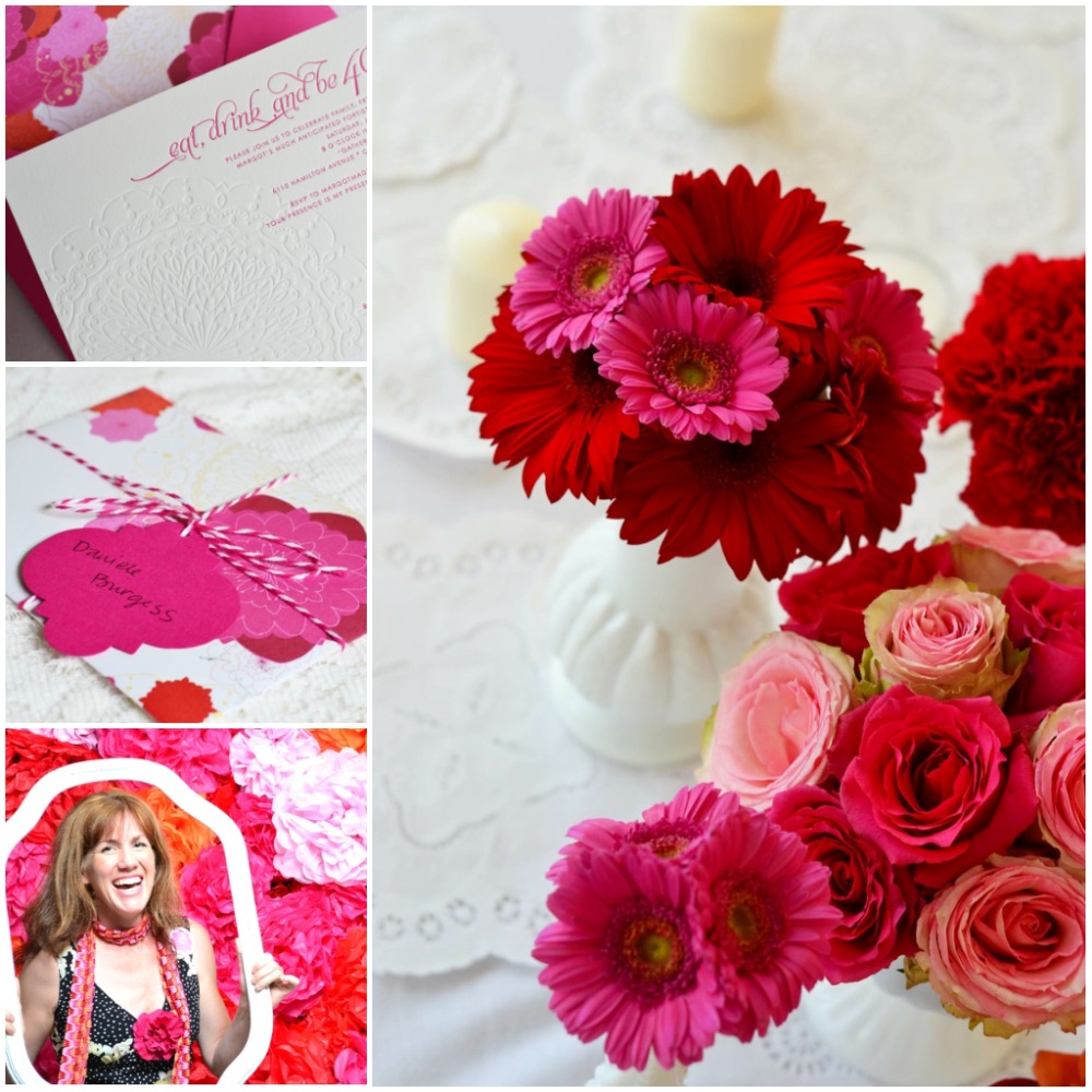
A few weeks ago I came upon this invitation from J Press Designs and was enamored. I stared at it for a really long time analyzing what I liked and why it was so attractive to me. I was on to myself and realized that I was subconsciously moving into a new color scheme.
Then I realized that it was slightly similar to another invitation I'd been ogling recently by Althea and Ruth from Minted. It's not quite the color scheme, but it's got the same idea.

Finally, when I went shopping this weekend (for a party dress-hmmm) I wore my red boho top with some gray shorts and my daughter, who was shopping with me, wore a coral boho top with some cream shorts. As I caught a glimpse of us in the mirror at the store the color scheme became the obsession.

I'm not sure how exactly to categorize the color scheme. I imagined me telling my sister as I do everything I'm obsessed with:
"So, I'm obsessed with a new color scheme!" I say, with a gleam in my eye.
"What is it this time." she replies with minimal eye rolling.
"Well, it's 2 shades of gray--I call them pearl and oyster--with red and coral and hot pink and kind of an aubergine color and olive-ish green and teal and mustardy yellow..."
Definite eye rolling at this point. "Isn't that just a bunch of colors?"
"Yes it is. But they are really pretty together and I can't get them out of my mind."

And that's all I can tell you folks. I've been missing exits while driving and stopping short in the mall to grab my sketch book and scribble yet another way I can use this multitude of beautiful color in my next set of invitations and designs. I'm going to call it my Summer Palette and see where we can go from there. What do you think? Are you obsessed with a color scheme at the moment?

Friday, June 3, 2011

Lord help me! There are only 22 more days until my 40th birthday party


Since I have so much planning to do, I thought I'd distract myself and share my birthday invitation. I so enjoyed creating this invitation! As my own customer, I found myself very open to new designs and quite agreeable--a dream client, really! I loved being able to do exactly what I wanted and revise until my creative heart was content. I wanted it to reflect everything I love about invitations, and it does.

The invitation is letterpress printed with an inkless impression mandala and hot pink text that combined flourished calligraphy (Aphrodite) and clean modern san serif (Century Modern Sans). The card is a super thick Crane's cotton stock with beautiful texture and luxurious weight. I designed and printed the custom liners especially for the invitation (after searching for too long on-line to find something just right, I realized that I was the person to create that very thing--duh!). I'm going to use the extra liner papers for the party details later. On the hot pink envelopes, I printed the mandala in a dark pink which was extended to the back flap where my return address was. Then I printed the guest's names stylized with the same fonts as the invitation. I'm quite pleased with the results, thank goodness. It is my job afterall, to please even my most discriminating customers! The invitations were a big part of my budget and I think they were worth every penny. Plus, I'm pretty sure I'm not going to throw myself another birthday party for another 40 years.


And on the title prayer, don't get me wrong, I'm SUPER excited for it. It's just, well 22 days doesn't seem like a lot to get everything together. I've been thinking about it for so long and planning for so long that the thought it will be real is daunting. While I was entering into panic mode last week, we had some cheap chinese food for dinner and THIS was my fortune. FOR REAL! Is that not the Universe giving me a wink or what??? I love it that when the "holy crap I'm not going to get everything done in time" feeling creeps up on me (like today) I think of that fortune and relax. If my friends and family are there with me, all will be perfect.

Wednesday, June 1, 2011

A little sewing project

I made this for my mama on mother's day, but I think it makes a sweet project any time of year.

Let me state that I am a crafter who requires free-styling projects--or, ones that take little prep time and don't take too long. I get bored pretty easily. Are you like that? I have so many friends who love taking their time to prepare for a project and I admire them so much! For me, I start to feel clausterphobic when a project takes too long. When a new project gets in my head I am full speed, drop everything, let the kids watch too much tv and ignore the dog crazy. I have to finish my projects before the next idea comes raging in.

Anyway, this was a nice project for those aforementioned reasons. I used a mandala design I'd created previously but I think any clip art you find on-line would work well (check that the art is not copyrighted, of course). You can also do a cute line drawing yourself--I think the campy and simple style works perfectly! Trace the image onto the fabric lightly with pencil. I don't know any fancy embroidery stitches, so I just did a straight stitch (in and out, in and out) for the whole design. I also was able to use the embroidery thread I've had for over 13 years when I cross-stitched a baby door hanger for my oldest niece who is now a full-fledged bikini wearing teenager. (where does the time go??) I put some thought into the colors, choosing what I thought would work well with my mom's decor, should she try to hang it somewhere by her bedside table (hint-hint). I used some plain white cotton fabric that was part of an abandoned project for my girl's room. I did have to purchase the embroidery hoop, but since I make a trip to Michaels about every week, this was not a problem. And since it the hoops cost a little over a dollar, this made for an inexpensive but special gift.

I also hand-wrote my message to her in pencil and stitched that in. So she'd know I love her. Cause I do. :o)

The mandala patter I used is attached and free for you to use (personal use only, please). I outlined the pattern only, but I think it would look nice if you filled in some of those petals with color (that would have been in the "takes too long for me" category). It should fit within a 6" hoop nicely. Have fun!!

Pin Me!

LinkWithin

Related Posts with Thumbnails