

Monday, October 31, 2011
Flightless Bird, the wedding version
A remake of an already uber-romantic song by Sam Beam of Iron and Wine. You Twilight fans will remember it as the song Bella and Edward dance to at prom, and it's going to make it's reappearance at The Wedding in the upcoming Breaking Dawn movie. If I was in 7th grade, I'd be hands on shoulders with a cute boy and we'd be slowly rocking around in circles until the cop/DJ announced "Snowball" and we had to change dance partners. If I was getting married, I'd be giving the dreamy eyes to my handsome new husband. See what romantic thoughts pop into your mind when you watch:
Friday, October 28, 2011
A lovely fairy party featuring April Eight
Man, if every day could be as amazing as this one I'd be a happy stylin' girl! I've been planning and planning for this wonderful day with April Combs Mann, singer and songwriter of delightful children's music April Eight. As with all projects, progress was slow at times and then picked up with lightning speed toward the end. It was so good to know that with the help of everyone involved; the beautiful children who enjoyed their day frolicking in the nature-loving fairy atmosphere, Gina Weathersby from Kiwi Street Studios who takes photos to steal your breath away, and of course April who is such a charming and talented performer, all our efforts were rewarded!
The April Eight winter CD will be released this November, so I'll keep you updated on that. We will also be collaborating on the party printables for this event so you can have a beautiful fairy party for your own wee people!
This was the photo booth area for the party. It was created with burlap for the swag, with lots of fantastical flowers made from tissue poms and adorned with papers, felt, ribbons sequins and everything else I had in my craft box. They were VERY fun to make. The kids joined in and had a ball. They were attached to the swag with clothespins, which also made them easy to move around or give away at the end as party favors. **Do not miss that adorable oversized mushroom that April made. Seriously, we thought it was the best decoration of the whole gig!

The food was light and wholesome but not without some sugary cupcakes! The cupcake toppers were made from colored fondant cut out with beautiful butterfly and flower shapes. I added some edible glitter and dusting sugar to make them more magical. We also served "fairy puffed corn" (aka popcorn) in colorful paper cones, "berries and sticks" (a mixture of dried fruits, berries and pretzels) and harvest apple cider.

The music...well, I'm obviously a fan so I'll give you my unbiased opinion ;o). April's songs are light-hearted, lyrical stories about fairies going to ice skating balls, goblins dancing, and finding the magic in everything around us. April's genuine love for musical entertainment and delighting children is a joy to watch. I can't wait for the CD to come out for myself!

A good craft idea to keep kids engaged in the party was the making of these "badges". Again, I pulled out all my ribbons, felt scraps, buttons, sequins, feathers and papers to let the kids go wild. Every one is more special and beautiful than the next. We attached a clothespin to the back so they could pin them anywhere...on their clothes, in their hair or just holding them as they ran through the yard to see the streamers float in the breeze. Charming!

Don't you want to see more? Many more beautiful photos of the event are on Kiwi Street Studio's blog here. If you are excited to have April sing at your next fairy party, you can contact her through her website. I'll have invitations available in the next week so you can have your own perfect fairy party too! If you'd like to see all the inspiration we used for this party, you might be interested in looking through the pin board we created on Pinterest here.
The April Eight winter CD will be released this November, so I'll keep you updated on that. We will also be collaborating on the party printables for this event so you can have a beautiful fairy party for your own wee people!
This was the photo booth area for the party. It was created with burlap for the swag, with lots of fantastical flowers made from tissue poms and adorned with papers, felt, ribbons sequins and everything else I had in my craft box. They were VERY fun to make. The kids joined in and had a ball. They were attached to the swag with clothespins, which also made them easy to move around or give away at the end as party favors. **Do not miss that adorable oversized mushroom that April made. Seriously, we thought it was the best decoration of the whole gig!
The food was light and wholesome but not without some sugary cupcakes! The cupcake toppers were made from colored fondant cut out with beautiful butterfly and flower shapes. I added some edible glitter and dusting sugar to make them more magical. We also served "fairy puffed corn" (aka popcorn) in colorful paper cones, "berries and sticks" (a mixture of dried fruits, berries and pretzels) and harvest apple cider.
The music...well, I'm obviously a fan so I'll give you my unbiased opinion ;o). April's songs are light-hearted, lyrical stories about fairies going to ice skating balls, goblins dancing, and finding the magic in everything around us. April's genuine love for musical entertainment and delighting children is a joy to watch. I can't wait for the CD to come out for myself!
A good craft idea to keep kids engaged in the party was the making of these "badges". Again, I pulled out all my ribbons, felt scraps, buttons, sequins, feathers and papers to let the kids go wild. Every one is more special and beautiful than the next. We attached a clothespin to the back so they could pin them anywhere...on their clothes, in their hair or just holding them as they ran through the yard to see the streamers float in the breeze. Charming!
Don't you want to see more? Many more beautiful photos of the event are on Kiwi Street Studio's blog here. If you are excited to have April sing at your next fairy party, you can contact her through her website. I'll have invitations available in the next week so you can have your own perfect fairy party too! If you'd like to see all the inspiration we used for this party, you might be interested in looking through the pin board we created on Pinterest here.
Thursday, October 27, 2011
Chai Shortbread Cookies

I hosted a fun baby shower last weekend and while I sort through the photos and prepare the Big Blog Post on that, I thought I'd share the recipe I used for Chai Shortbread Cookies.
I'm not usually one to brag, but these were really tasty! Scotch Shortbread cookies are kind of my go-to cookie. I roll out the dough, cut whatever seasonal shapes I need and add a little glaze. De-lish! Since the food for this shower had more of an autumnal flavor, I adapted my usual recipe to the fall flavors that chai tea embodies.
Here is the shortbread recipe:
2 sticks (1 cup) unsalted butter, softened
2/3 cup confectioners sugar
1 tsp. vanilla extract
1 3/4 Cups flour
1/4 tsp salt
1/4 tsp each of ground cinnamon, ground nutmeg and ground coriander
Preheat oven to 350 degrees F. In a large mixing bowl, beat the butter and sugar until smooth and creamy. Add the sugar and vanilla and beat well. In separate bowl, combine the flour, salt and spices. Add that to the butter mixture one scoop at a time until combined and the dough holds itself together in the mixing bowl.
Dust a flat surface with flour (along with your rolling pin) and roll out half the dough cutting shapes with cookie cutters. Keep going until you're all out of dough and eat the leftover scraps. Using a spatula, transfer the cut cookies to an ungreased cookie sheet. Bake for about 12-15 minutes, just before they start to turn golden. Transfer to a wire rack to cool completely.
Glaze:
2 Cups confectioners sugar
up to 1/4 cup of milk
food coloring if you plan on tinting the color
various nonpareils or decorating sugars
Slowly add milk into the sugar until you have a slightly runny consistency. This will take a few tries and some adjustments, but you want the glaze to move over the cookie without running right off. Plan on sacrificing a few cookies for this purpose and eat those too.
Prepare a space on your counter or table by placing a piece of waxed paper under a wire rack. Place a cookie on a large fork or that special thingy with all the prongs. Then use a regular tablespoon of glaze and pour it over the cookie, pushing the glaze to the edges with the back of the spoon. Put the cookie on the rack and move on to another.
I'm a bit of a minimalist when I decorate cookies, so these ones had just a little sprinkle of white nonpareils in the center. Tip: You don't want to add these or sugar sprinkles right after you put on the glaze. Wait about 10 minutes for the top to set a little or the sugar will bleed or drop below the surface of the glaze.
Monday, October 24, 2011
Spot Varnish Printing
One of the newest printing techniques available to me now is called "Spot Varnish". Basically, after a card is printed on a full color off-set press, it passes through the press one more time to "print" a coating of glossy varnish. Usually, this is done as a solid coating because it adds waterproofing and a nice glossy look to cards. Some printers (like mine) offer an option to print specific parts of the card with the varnish.
I really like using this technique because it can add a little something special to any printed card. Here is an example of an invitation I just finished:

Since more than 900 invitations were being sent, the client needed to keep the costs down but still wanted a formal feel to the invitation. I thought a tone-on-tone pattern added to the border would do just that, so I printed the card with a plain black border and added the spot varnish as a pattern only on the border. I carried out the same technique on the reply postcard for consistency.
Another way I've used the technique is to call out an aspect of the invitation in a subtle but sophisticated way. This Bat Mitzvah invitation has each event card called out not only by it's distinct color, but by writing "celebration" or "bat mitzvah" in a spot varnish. Cool, huh?

Friday, October 21, 2011
DIY Friday: Recycled Milk Jug Skeleton
I love to spend money like most Americans, but there is something so exciting about using recycled or repurposed items when working on a home decoration or craft project. My mom loves the "making a silk purse from a sow's ear" concept of taking something ugly and making it beautiful. I just plain love the fact that I didn't have to spend any money on it. If it's free, it's okay to throw away at the end of the season, and there is no pressure if you don't even like what you did. Nothing wasted!
In that vein, this is an adorable skeleton made from milk jugs that I spied on Craftzine. The tutorial and template is on The Party Animal blog. The translucency of the plastic is perfect for a little ghostly trickery. Cute, yes? You whip that up this weekend, can't ya?

In that vein, this is an adorable skeleton made from milk jugs that I spied on Craftzine. The tutorial and template is on The Party Animal blog. The translucency of the plastic is perfect for a little ghostly trickery. Cute, yes? You whip that up this weekend, can't ya?

Wednesday, October 19, 2011
Color Palettes for Fall Inspiration
I'm a lover of color, aren't you? When starting a project, I often begin with a color palette that speaks to me for whatever reason. As I travel through the creative process, which as you might know is often a long and winding one, that palette is like a map to keep me on track. When things are not looking right, I'll refer to my original palette/image and see where I went astray.
Are you planning something for fall? A room redo, host a party or a fall wedding? Take a look at these beautiful and unusual color palettes from some of my favorite blogs and websites:


 And also be sure to check out ColourLovers to see what color combos users are currently trending in interior design, branding, handcrafted and more.
Are you planning something for fall? A room redo, host a party or a fall wedding? Take a look at these beautiful and unusual color palettes from some of my favorite blogs and websites:
If you are really inspired by something you see on-line, here is a website called Degraeve that will generate a palette colors of any photo you choose from an on-line url image (tip: click on the image until it's the only thing remaining on your screen, then right-click on the image and select "copy image location" which will give you the url to paste into the box. Here is a sample of one I did:

Monday, October 17, 2011
A Peculiar Mantle Display

For weeks I've been thinking and thinking about what kind of autumnal presentation I might do on my fireplace mantle. While I waited, things started accumulating around my house to stimulate my yet incomplete thoughts. First, my husband brought home a box of osage oranges (sometimes people call them monkey brains). Those are the lime green orbs with a bumpy and convoluted texture on the outside. I love those things, and did you know that they keep spiders away? Then I was perusing the sale aisle at Michaels and saw some sparkly black ravens and purchased 5 (there are 5 people in my family, so that is my default number when I'm being spontaneous). My husband chopped down our old sunflower stalks and I had him save the expired seed heads for me. The tipping point on the creative scale was the beer I had on Saturday night, and with a gleefully unscheduled evening to inspire me, I started my mantle of dead flowers and natural curiosities.

If you were my neighbor, you would have seen me take several trips out to my dying and untended front yard to collect whatever was still sticking up from the ground. Dried up hydrangeas, sedum (technically alive, but not for long) and purple cone flower seed heads were left for me to gather. Luckily it was dark so I had no idea where the spiders were in the garden. That's wimpy of me, but spiders are a big impediment to my autumnal gardening adventures. They're everywhere!


I'm having a baby shower this weekend, so I wanted to have an elegant design that made you look twice and feel slightly creeped out. I put the ravens about the arrangement to suggest that they were plotting something while we weren't looking. The blank picture frame (I swear I've used that so many times this year!) makes me feel unsettled and, the river wood has such wonderful textural and bone-like appearance. The little prickly green things the ravens are chatting over are actually gourds or squashes or something. The vases were from my milk glass collection, which add a contrast of man-made ornamentation. Overall, I'm happy with the effect! My husband keeps calling it the mantle by Morticia Munster, which I think is a compliment. I'm still undecided whether I'll add a candle something-or-other but this is how it will look until then.
What are you doing on your mantles? Creepy or refined this year?
Friday, October 14, 2011
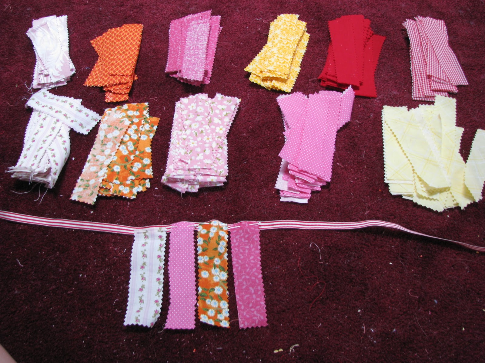
DIY Friday: How to make a fringe party banner
This is going to be a quick and easy tutorial because I can only do hack-jobs at instructions. The cute fringe banner I created for Meredith's Kitchy-Kitchen birthday party was one even I could handle--although I did get my sister to sew the straight line on her machine. I still can't seem to get a bobbin threaded on mine and don't get me started talking about that roadblock to my creativity. And by saying that this was a project even I could handle, I mean there are no complicated and strict guidelines and rules to follow. "Close enough" is perfectly appropriate in this case.

YOU WILL NEED:
-3/8" or 1/2" width ribbon I suggest grosgrain because it holds it's shape nicely and won't snag or stretch when you sew it. Obviously the length depends on how long far a distance your banner needs to cover and I don't believe in over thinking this part. In my case, it was "really long", or, about 7 feet.
-fabric cut roughly the size of 1.5" x 6" with pinking shears. The kitchy charm of this is the loose thread and pinking shear edges. Everything looks cuter with pinking shear edges. I used about a dozen different cotton fabrics with large and small design patterns.
-about a million straight pins
HOW IT'S DONE:
Since I was working with a dozen different fabric styles I set them out in front of me in piles and played games with myself to create a "random" pattern. First I went from left to right, then I went right to left, then one from the top, one from the bottom. You get the gist. Just don't make yourself too crazy on this part.

Pin the top edge of the fabric onto the ribbon, going past the half-way point, but not overhanging the top of the ribbon. Remember that you are going to sew a straight line across the center of the ribbon and you want to hit each fabric strip.
*Here is the only important rule* so read this! Pin the fabric wrong-side facing you! As you can see, I took the photo before I figured this critical fact out. That kind of thinking probably comes naturally to those experienced with sewing, but since I'm not in that group I forgot and had to re-pin half my banner. A real damper on my forward progress. Here is the corrected fringe:

Leave about 10 inches on each end of the ribbon to allow you to tie the banner onto something.
Sew a straight line down the middle of the ribbon to attach all the fabric pieces and you. are. done!
I made two banners and draped them over each other for added festivity. Here's how they looked, if you missed the original post.


YOU WILL NEED:
-3/8" or 1/2" width ribbon I suggest grosgrain because it holds it's shape nicely and won't snag or stretch when you sew it. Obviously the length depends on how long far a distance your banner needs to cover and I don't believe in over thinking this part. In my case, it was "really long", or, about 7 feet.
-fabric cut roughly the size of 1.5" x 6" with pinking shears. The kitchy charm of this is the loose thread and pinking shear edges. Everything looks cuter with pinking shear edges. I used about a dozen different cotton fabrics with large and small design patterns.
-about a million straight pins
HOW IT'S DONE:
Since I was working with a dozen different fabric styles I set them out in front of me in piles and played games with myself to create a "random" pattern. First I went from left to right, then I went right to left, then one from the top, one from the bottom. You get the gist. Just don't make yourself too crazy on this part.
Pin the top edge of the fabric onto the ribbon, going past the half-way point, but not overhanging the top of the ribbon. Remember that you are going to sew a straight line across the center of the ribbon and you want to hit each fabric strip.
*Here is the only important rule* so read this! Pin the fabric wrong-side facing you! As you can see, I took the photo before I figured this critical fact out. That kind of thinking probably comes naturally to those experienced with sewing, but since I'm not in that group I forgot and had to re-pin half my banner. A real damper on my forward progress. Here is the corrected fringe:

Leave about 10 inches on each end of the ribbon to allow you to tie the banner onto something.
Sew a straight line down the middle of the ribbon to attach all the fabric pieces and you. are. done!
I made two banners and draped them over each other for added festivity. Here's how they looked, if you missed the original post.

Tuesday, October 11, 2011
DIY Invitations? Here's how to avoid some disasterous results...

The printing world is changing SO FREAKING FAST! Why, it was only 10 years ago that we were keeping logos in one color because they needed to be economically printed that way. Off-set was really still the best choice for clear, crisp imagery on a variety of papers and that required some skill in setting up text and images so that the printer could use them to create a correct final product.
But things are so delightfully different now, and changing to our benefit every day. Your local printer (and I don't mean Kinkos or FedEx Office or whatever they're called now) can whip up some laser prints for you in a day, chop it all up for you and *bam!* you've got an invitation that looks great and was half the cost of even the cheapest on-line retailers. If you've got the will, I say "You Go Girl!" and I also follow that cheer with "Proceed with caution!"
If you're planning on going this route, keep in mind that there is a certain amount of planning that will avoid making this a "bawl your eyes out in your car with a box full of misprinted programs in your lap" experience. I've been designing and producing invitations for over 15 years and I still run into issues now and then. Here are 10 tips to keep the tears at bay.
1. BEFORE YOU DO ANY DESIGNING find your printer and meet with them. You've got a lot to discuss and a first meeting will give you a great starting point. If your printer is a real uncooperative jerk (and some are, unfortunately) then find another one. You want assistance, not an "that's not my job and I'm pretty sure I don't like you" approach to this project. Find one who is friendly and appears competent (they may even have done invitations before and you can look at their samples). If you are open about your skill level and listen to their suggestions, they will in turn help you along the process and the results will be what you'd hoped. If your friend is designing these for you, then make sure they are also at this meeting. Many graphic designers are not used to designing for paper and print, and this is helpful for them too.
2. ASK WHAT KIND OF PRINTING they offer and how much each costs. Usually, they will offer off-set printing which can be moderately priced for one color, but become expensive with more colors or certain cardstocks. Many now offer laser printing, which produces a crisp image in a multitude of colors and often priced as a budget friendly option. Ask what the limitations are for each printing method. For instance, my local printer doesn't run envelopes through his laser printer so we agree to do that with the off-set press. You also will likely not be able to run small or odd-sized items through any printer so that's important to know too.
3. BRING SAMPLES or pictures of what invitation styles you like. Just like your hairdresser, a picture can speak volumes in words you don't possess. You may want a triple layered pocket-fold with die cuts but they may not able to do that for you and may not even know where you can get that. Best know that early on in the design process.
4. ASK HOW TO PREPARE THE FILES by finding out what kind of programs and digital files they need for final artwork. Usually a pdf file is sufficient, but they may have certain specifications that will make the process run more smoothly on their end. They may also need the fonts you used, and the images as digital files as well.
5. ASK ABOUT PAPER AND CARD STOCKS you want to use. Some stocks give their machines fits and they will likely know which to steer clear of. Stick to something he/she is familiar with in a size that works. If you plan on sourcing your own stock, ask how much they will need, including overages. They will often need extra as they set up the printer, and you should plan on an extra 10-25 qty for your own imperfections in the process.
6. TALK ABOUT THE FINAL SIZE of your invitation. You may have played around on your computer with a design that is 6x7.5, but I dare you to find an envelope that will coincide with that invitation size. Ask your printer what a standard envelope size is for the style and shape you'd like and design your invitation from there.
7. ASK ABOUT PRICING because you need to know before you get involved in this project. If you intend to provide your own stock, ask how they will resolve a misprinted job. They may reprint free of charge, but are you expected to purchase more stock? Trust me, it's better to be up-front with these issues.
8. BE FLEXIBLE because what you want may not be the easiest to produce. Often times, you can create something close to what you had envisioned but with some tweaks to make the process smoother. If your printer is giving you that "I'm not so sure about that idea" head tilt, then back awaya little bit. Ask about options that could get you closer to the concept. Unless you are super experienced and know how to overcome the challenge yourself, the resistance is deadly to your project.
9. MEASURE EVERYTHING and then measure it again. Then make a life-sized sample, put it in your envelope and see if it still fits. I cannot tell you how many times a mis-measurement will sabotage your entire project. Measure and measure and make a sample and measure again.
10. COMMUNICATE every little freaking detail! When it is time to hand the files over for printing, Assume that you've never had any conversations at all and he's forgotten everything you talked about. Go over the job in person with each detail for each item needed. This is what they need to know before starting.
-Final trim size
-Final folded size (if applicable)
-Scoring lines and where they go
-Color/Ink needed
-What printing process you expect to use
-What the paper is you're using
-How many you need (plus extras)
-When you need them completed
-What you expect the cost to be (since you already talked about that, this is a good time to bring it up again)
-What your files are named and the program used to create them
-Bring a sample, even if it's not printed, to show how you want it to go together
-Your shoe size (just kidding, but you get my point now right?)
Friday, October 7, 2011
Inspiration to Invitation: A Margot Madison Design Exposé
Every once in a while, I think it might be interesting to show you how I get some of the designs I create. It makes me feel a little vulnerable actually, I don't even show people my sketchbooks! But I am continually fascinated by creatives and how they are influenced by other artists, and the world around them.
In yesterday's post, I talked about Mary Blair, an illustrator who created iconic illustrations in the 1950s and 60s. I was particularly inspired by this book cover, and thought I should try to use it to push me in a fresh direction.

I've been working on a party concept that is a woodsy-fairie theme for my friend and brilliant songstress April 8. After seeing that book cover, I decided to give that style a try for the invitation. Here's what mine ended up looking like:
 The most interesting thing to me is that I created the invitation design by recycling artwork that I've had for years. The birch trees in the background are from a cute winter save the date I did about 4 years ago. The bird and the mushrooms were part of a holiday card series I did about 3 years ago. The berries and branches I'd created the day before on another holiday project. Even the starburst shape that makes the white space of the invitation came from some sketches I did this summer on vacation.


I literally had all the pieces for this design, I just needed to see them with a fresh pair of eyes! I also used a really cool set of Illustrator Brushes to make the textured strokes which add some depth to my otherwise quite flat and computer-ized images. It makes me wonder: did my subconscious liked Mary Blair's cover because it was so close to something I could create, but just hadn't yet? Or did it take away the overwhelming fear I have in creating a more "complete" illustration? A single image is easy for me but many images within a colorful composition scares the heck out of me. Maybe the difference is that I wanted to try. I didn't know if it would work at all, but as the great saying goes, "Nothing ventured, nothing gained". And I like how the invitation turned out. More importantly I am so rejuvenated by the process of creating because of it. The creative mind is such a mysterious and interesting place, don't you think?
In yesterday's post, I talked about Mary Blair, an illustrator who created iconic illustrations in the 1950s and 60s. I was particularly inspired by this book cover, and thought I should try to use it to push me in a fresh direction.
I've been working on a party concept that is a woodsy-fairie theme for my friend and brilliant songstress April 8. After seeing that book cover, I decided to give that style a try for the invitation. Here's what mine ended up looking like:
 The most interesting thing to me is that I created the invitation design by recycling artwork that I've had for years. The birch trees in the background are from a cute winter save the date I did about 4 years ago. The bird and the mushrooms were part of a holiday card series I did about 3 years ago. The berries and branches I'd created the day before on another holiday project. Even the starburst shape that makes the white space of the invitation came from some sketches I did this summer on vacation.

I literally had all the pieces for this design, I just needed to see them with a fresh pair of eyes! I also used a really cool set of Illustrator Brushes to make the textured strokes which add some depth to my otherwise quite flat and computer-ized images. It makes me wonder: did my subconscious liked Mary Blair's cover because it was so close to something I could create, but just hadn't yet? Or did it take away the overwhelming fear I have in creating a more "complete" illustration? A single image is easy for me but many images within a colorful composition scares the heck out of me. Maybe the difference is that I wanted to try. I didn't know if it would work at all, but as the great saying goes, "Nothing ventured, nothing gained". And I like how the invitation turned out. More importantly I am so rejuvenated by the process of creating because of it. The creative mind is such a mysterious and interesting place, don't you think?
Thursday, October 6, 2011
Inspiration from Mary Blair, illustrator
While scanning Pinterest this morning, I saw this illustration that really got me excited. I am so attracted to the rich colors, the simple styling of the flowers and butterflies, the child seems happy and free, the font used is not a font, but hand drawn letters. It's graphic but with elements like stippling that give it texture and charm.
I love it so much that I decided to do a little more research on the artist. Her name is Mary Blair, and she worked for The Walt Disney Company producing iconic concept art in the 1950's and 1960's. That image that first caught my attention was the cover of a Golden Book I Can Fly which has never been out of print. She was also responsible for creating the whimsical look of the Disney attraction It's a Small World, as well as the concept art for Alice In Wonderland, Peter Pan and many more. I am a new fan of this underrated and more unknown artist. I love her ALMOST as much as I love Charlie Harper (and don't even get me started on him...)
I love this mosaic at Disney's Contemporary Resort. Again, color! graphic minimalism!

Here are some more of the illustrations she did for Golden Books, which are so beautiful. I'm so glad I spent some of my time today learning more. I have to also thank Suzanna from CitrusAndOrange who my personal muse for always-inspiring images. I swear, any time I see something I LOVE, it has her name attached to it somehow. If you'd like to view some more of Mary Blair's illustrations, I've got some more here.
Wednesday, October 5, 2011
Halloween and Fall Decor Ideas
I've found some beautiful inspiration for fall decorations. If you like to leave your decor up longer than is seasonally necessary (*cough* christmas lights *cough*), many of these can easily take you pre-Halloween and beyond.


What?? That wasn't enough for you??? Me neither. You can see more in my Halloween/Thanksgiving Pinterest Board. ;o)
What?? That wasn't enough for you??? Me neither. You can see more in my Halloween/Thanksgiving Pinterest Board. ;o)
Subscribe to:
Posts (Atom)