Showing posts with label Color Inspiration. Show all posts

Tuesday, November 22, 2011

Last year's Thanksgiving table

Thanksgiving really crept up on me this year! While I have the theme and general idea of how we'll be decorating this year's Thanksgiving table, I'm not together enough to get the table set before Thursday and get the photos ready to share. I thought I'd revisit last year's beautiful table as a precursor to this year's, and I will tell you that this year's colors are going to be copper and blue!

Reposted from November 23, 2010
This is what 3 crazy and over-stimulated women can do in an afternoon when they have more on their agenda than is humanly possible (even for a mom!). I've been eager to do a table setting so that I can get more practiced at it. With Thanksgiving coming up, it seemed as good a time as any for my first official project. I gathered a few of my creative peeps on a Thursday and we brainstormed the details. My main inspiration was this photo from Leslie at A Creative Mint (the pinnacle of color inspiration and beautiful photography in my humble opinion):


Not having the time to make a quick trip to Morocco to get the delightful cups Leslie used, I had to improvise. I have some charming pressed glass cups at my house which I use for wine glasses (strange to some perhaps, but provincial to me and no broken glass stems in the dishwasher), and I'd just purchased some silver/gold Alhambra patterned votives from Crate and Barrel so those went into the creative soup. We have Thanksgiving (and most family events) at my sister Alex's so hers was the setting, table linen, silverware, and more. Aren't those flower plates beautiful? They come from Lindsay's room mate's collection of beautiful finds from Lord knows where (and likely some thrift store or Goodwill). Alex and I both contributed all our crystal candlesticks. Karyn (the photographer and creative muse) brought the silver mini pedestal with glass dome, which just was so cute. My point here is that everything on this table was borrowed, begged or bespoke. I want to thank Karyn, Lindsay, and Alex for their efforts and willingness to participate in my creative obsessions--I mean--projects. Everyone is super busy, so this was no small feat to find time and energy to spend on a "fun" project when you should really be wrapping presents, finishing newsletters, responding to charity emails etc. I begged Karyn to get me the 4 photos so I could post BEFORE Thanksgiving and so I am especially grateful. Thank you ladies again!! So without further ado, the photos please!
Karen's silver mini pedestal with a glass dome, pomegranate

Plates with gold chargers

My mini books as place cards. Each guest can write a nice note on the pages inside!

Karen added the gold trim around the glass rim.
Of course, even though we were going on and on about how much we had going on in our lives, we couldn't help ourselves but start planning the next event table. Creativity is a chronic and contagious disease, but you know that because you have the same affliction. Have a great Thanksgiving to you! If you have some creative thanksgiving tables to share, send them my way!

Thursday, June 9, 2011

What's the new stripe? The Chevron!

Like most upcoming fashions and fads, this has been creeping up on me. A little chevron tray craft from Martha Stewart here, a little chevron dress at Talbots there. I've been filing these images in my brain for a while, and have played around with some chevron ideas myself. I must say, I quite like it! It's bold. It's got movement. It's an ancient design with a modern aesthetic and it suits me just fine.

Here more chevrons from designers that are inspiring me. Credits are listed below and don't miss the FREE iPHONE wallpapers at the bottom.

1. Needlepointed belt buckle by NeedleYou
2. Calling cards by Pixel Impress
3. Birth Announcement by Roxter Designs
4. Digital printables by Summit Avenue
5. Upholstered Chair by Nena Von
6. Tea Towel by Erin Dollar
7. Pillow by Elegant Touch
8. Handmade journal by Mayday Studio
9. Flat notecards by Sweet Beaker

To further celebrate the chevron, I'm including some free iPhone backgrounds with both the chevron AND the summer color palette. You can use and share these for your personal use (copyrights stay with me) by right clicking or saving the image into your image folder on your phone. Then, just choose it as a background and you're ready with the chevy!

Monday, June 6, 2011

Inspiration Monday-Summer Color Palette

I'm not a big purse or shoe person. I usually find one thing I like, and wear it until it falls apart. When last year's purse from Charm Design started fraying on the handles, I mourned! This was a good one, and I always got so many compliments for it. But like a good soldier, I did what I had to do and started another search on etsy. It didn't take long before I fell in love with a beautiful bag from a french etsy shop called Ika Bags and purchased it immediately. When it arrived, I looked at the 2 purses and had a little chuckle to myself. They coordinated with each other perfectly!
Last year's purse

This year's purse...it's really a pretty bag but I realized that my sketch book needed to be with me at all times!
A few weeks ago I came upon this invitation from J Press Designs and was enamored. I stared at it for a really long time analyzing what I liked and why it was so attractive to me. I was on to myself and realized that I was subconsciously moving into a new color scheme.
Then I realized that it was slightly similar to another invitation I'd been ogling recently by Althea and Ruth from Minted. It's not quite the color scheme, but it's got the same idea.

Finally, when I went shopping this weekend (for a party dress-hmmm) I wore my red boho top with some gray shorts and my daughter, who was shopping with me, wore a coral boho top with some cream shorts. As I caught a glimpse of us in the mirror at the store the color scheme became the obsession.

I'm not sure how exactly to categorize the color scheme. I imagined me telling my sister as I do everything I'm obsessed with:
"So, I'm obsessed with a new color scheme!" I say, with a gleam in my eye.
"What is it this time." she replies with minimal eye rolling.
"Well, it's 2 shades of gray--I call them pearl and oyster--with red and coral and hot pink and kind of an aubergine color and olive-ish green and teal and mustardy yellow..."
Definite eye rolling at this point. "Isn't that just a bunch of colors?"
"Yes it is. But they are really pretty together and I can't get them out of my mind."

And that's all I can tell you folks. I've been missing exits while driving and stopping short in the mall to grab my sketch book and scribble yet another way I can use this multitude of beautiful color in my next set of invitations and designs. I'm going to call it my Summer Palette and see where we can go from there. What do you think? Are you obsessed with a color scheme at the moment?

Tuesday, May 10, 2011

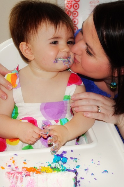
Rainbow Birthday Invitations by Sara Cormier

I admit to falling completely under the spell of rainbows. They are so 80's and therefore so magical! I'm working this theme into my daughter's birthday party this month. Of course, her birthday is in 4 days, so I'd better get crackin' eh? I'm such a great mother....

Speaking of great mothers, I wanted to show you this screaming cute birthday party invitation created by Sara Cormier of Miller/Cormier designs. I met Sara a few weeks ago and was smitten with her and her mad design skills. Sara was kind enough to share this invitation and the adorable pictures of her daughter Carmen on the Big Day.

"Celebrating 365 days of total cuteness"?? --only a mom could come up with a line that good!
Check out that adorable outfit--rainbow colors to match!

Of course, a Rainbow Cake!!! That's a mom who loves her little girl. My girl is just getting rainbow jello.
For more rainbow inspired photos and DIY ideas, you are welcome to view my Pinterest board here. I've got some great ideas for parties and gift wrapping there too.

Monday, March 28, 2011

Numbered Gift Wrap

So my daughter turned 11 this weekend. THE ONLY thing she wanted was an iTouch so I crunched some numbers, held my breath and bought one at the apple store. Then I prayed really hard that she wouldn't lose it or break it within the first month.

I wanted the Big Gift to be the last one she opened, so I thought about numbering the packages. Then I thought about making use of my new Silhouette SD. Then I cleaned out and organized my decorative paper stash so that I could find the right paper for the job. 2 hours later, I was ready to create!

I'm mostly pleased with how they turned out. I wish I had a little more time to better style and tweak the photograph since I'm still learning on my new camera. But I'm glad for the project and the weekend that allowed me a little time to put into it. It's the little things, you know...

Wednesday, March 23, 2011

Fall color forecast: Bamboo yellow

I know spring has just arrived, but in the event planning world fall is the season we have to think about. Planning does take a lot of time, doesn't it? So some of you brides out there are thinking about colors for your fall wedding. I thought I'd start with Pantone's color forecast for fall and offer up some creative ways to bring a little something special to your event based on these colors.
Today I am offering some event detail inspiration for Pantone 14-0740 Bamboo Yellow. I like this for a fall color because it is kind of overlooked when we think of burnt oranges, deep purples and rusty browns or autumn. Brighter, more summery yellow is toned down with a little green in the mix, and some warmer color mixed in to mute it down. When I think in CMYK terminology, there would be a bit of cyan and magenta and just a touch of black added to the yellow. But I digress.

Here is my collection of bamboo-inspired event goodies. More images are on my Pinterest Bamboo style board, which you can also view here. Links and credits will be listed underneath.
Bamboo inspired event details curated by Margot Madison
1. Amazing chandelier with a chinoiserie flair from Design Manifest.
2. Darling wedding print (great gift, isn't it?) from Smile Blue Eyes
3. Guest Sign-in Box (brilliant idea, eh?) from Cut The Cake Designs
4. Butterfly gift box from Fast Running Fox
5. Lanterns at a reception from Style Me Pretty
6. Custom wine labels from Absinthe Custom Prints
7. Dress from Gina Michele Eco
8. Pocket Mirror (bridesmaid favors, anyone?) from Gamiworks
9. Table decor from Style Me Pretty
10. Yellow invitation from the fabulous designer Margot Madison :o)
11. French Nougat from Kettle Creations. I love the added pops of green and cherry red in those.
12. Parasols from Occasions by Design

Tuesday, March 15, 2011

Rainbow Color Inspiration

With a dull rainy day outside, I need some color and fast! Here is a spectrum of products and photos that brightened my day today.
Kudos to the following rainbow makers:
1. Crafty flowers by Scrapbooks Etc.
2. Rainbow yarn gift packaging by {4.bp.blogspot.com--this link doesn't work and I can't find one that does. That's the best I can do. If anyone can send me a proper link, please do so I can update this}
3. Monogram Cookies from Sugar And Flour
4. Flower arrangement from Johner RM, photographed by Peter Carlsson
5. Tableware from Huset
6. Yarn bangles from Mystic Fibers
7. Felt balls from Craftastic Parties
8. Vintage Floral fancies from Isabella's Collections
9. Balloon topiary from P Is For Party
10. Pixel inspired cake stand from A Subtle Revelry
11. Felt circle pillow from Dede Etsy Shop
12. Paint swatch notepads from Crabapple Design

Thursday, March 3, 2011

Winter Bat Mitzvah with Blue and Green color scheme

Man, I've been on the busy side here in the studio. That's good for me, but not so good for the blog posting schedule.

Today I thought I would share an inspiration board I created for a client whose Bat Mitzvah invitations I'm creating.

The party celebration is taking place at a winter club this fall. It's a rustic "aprés ski" kind of place with ice skating for the teenagers and a nice dinner for the adults on a separate floor. The venue has dark wood interior, so I suggested winter white as the neutral background, using different textures to compliment the rustic feel of the venue. Then I added some bright blue and green as accents (these were not your typical pink and purple twin girls), and created patterns to enhance the accent colors. I must say that I love the mittens--twin girls, winter theme--perfect!

Now, I created this a few months ago (before I started including the blog/artist in the name of the image), so I hope I can credit the photos properly. If you see an error, please let me know and I'll change it immediately.

Top left section is original artwork created by me, Margot Madison. Fonts are LaPortenia, Freebooter Script, Evangel, Eccentric and Terracotta regular, available from either Fonts.com or Dafont.com. Photo on top right is from Once Wed. Wood tag blanks from The Hickory Tree (logo customization is by me), Pom-pom trim from May Arts Ribbon, Cookie by Queen City Cookies, votive glasses from Cultural Intrigue, Blue pops picture from Once Wed, Wooden table number (similar) from Bragging Tags, Wood candle centerpieces (similar) from This Fine Day, Wood sign (similar) from Bragging Tags.

Here is also a good dessert table in similar colors from Whipperberry.

Tuesday, February 15, 2011

Using Fabric on Invitations-A great tutorial


Aw man! I've been trying to figure out how I could get fabric on an invitation for a while now. I love fabric so much, and I knew in my heart it could be done, but I just hadn't had the motivation to give it a try. And I was feeling strange about what to do with the raw edges.

Today I saw this and must share. It is an amazing tutorial from Merriment Design which includes a free printable, plus a video for those of you visual learners (like me). Imagine this concept with other fabrics! I just bought some vintage tablecloths impulsively and I think I might be able to work this into my birthday invitations...we'll see. But how cute would it be for a baby shower or birth announcement?? Darling. Thanks to Kathy for sharing.

Monday, February 14, 2011

Pantone Color Forecast for Fall 2011

Pantone has selected an array of colors that are the trend for fall. Does Pantone influence the designers, or do the designers influence Pantone? Classic chicken and egg issue, and I'm too sick with a head cold at the moment to worry about those deeper design issues.... I do like that coffee liqueur color. It's the color of my yoga pants I'm sporting this morning ;o)

Tuesday, February 1, 2011

Color Inspiration-White with Pinks and Reds

This weekend I was visiting my cousin and her husband (and 2 dogs) in Ann Arbor, MI and so enjoyed the town, shops, food and music concert we saw. It must have opened up my creative vents because Sunday morning, I woke up with the color scheme for my 40th birthday party decided. This has been something I've been struggling with because since I do "colors" for a living, I wanted it to be really exciting and fresh. I also wanted to still like the colors when the party arrives--I may love one combination now, but will I have "moved on" by the time the party comes around and feel stuck? I knew I had to include powerful and bright colors because I always like those. I had to be able to have some flexibility within the scheme since I like so many colors and would want to include them. AND I had to come up with something that wasn't "an all over the place" visual mess. It's tough when you like so many things because you want to have them all in one place! I'm using the 80%/20% rule of color success with this scheme. I consider the tones of pinks and reds to be one color.  Here is the final result:


I'll elaborate on the inspiration story further and tell you about the "seed" that started it all. Several months ago, I mentioned an etsy store called All The Luck In The World. I couldn't get this photo out of my mind's eye! I love the fresh white background for simplicity accented with bright clusters of color. Since my venue "Gather" (pics here) is mostly white with touches of turquoise, orange and green in the art installations I thought this would be the perfect time to use this image for my inspiration. Here it is again, enlarged to show detail:
The funny thing is that in my mind's memory, there was a lot more of the bright pink and tomato red in the vases. The Margot Version of this photo is what spurred on my color inspiration for the event. I was hoping to be "efficient" and find just the right proportions of color in a beautiful photo on line, but of course I didn't. Unaffected by the huge work load on my plate today, I set about creating my own color inspiration photo (the Universe was not going to let me be lazy today!) and gathered anything in my studio that had the colors I needed. Since the weather is a dreary freezing rain, I had not enough natural light coming into my house where I originally set up the shoot. A more stable person would just pack everything into a box and work on it another day since there was light but not me! Freezing rain be damned, I packed everything up and arranged my shoot outside. Personal sacrifice aside, I'm pleased with how I captured the colors and the tone of the event. Note that I added some papers with patterns, a little bit of sparkle in the bird and the textures of white. This will give me some fun elements to use when creating my festive atmosphere at the party. I didn't bring in the soft aquas and turquoise that you see in the vases above since the art installations will do that already. I'll leave those as my touch of odd color to shake things up at the event.

Here are a few more detail shots to flesh out the details of the palette.


There was another sacrifice made for the art today though, and it wasn't just a good night's sleep since I'll have to stay up late completing my neglected work. My puppy Baxter got a little too interested in the orange on my styling table and pulled the entire display over! Most sad for me was that my favorite white bowl with gold filagree trim broke in half. Boo! :o( Serves me right. There's Baxter absconding the roll of paper that fell out...

Thursday, January 27, 2011

5 "secrets" to great event planning

I'm going to be doing a presentation soon on party details and was thrilled to see this post to help me turn my random ideas into a more cohesive whole. My mantra: "The party is in the particulars" (That's not really my mantra, but I'm trying it out today to see if it fits). Anyhoo...

There are some easy-to-accomplish suggestions from Jordan Ferney at Oh Happy Day that are sure to make your party more fun and more stylish. The most important piece of advice is that you don't have to do everything Overachiever Girl---just do something! Pick 1 or 2 or 3 things that make your event stand out or make your guests feel like having fun and that's all you need. The rest could be pigs in a blanket and some cheap beer if you want. ;o)

Teaser photos here, but be sure to visit the post and read all about it.
Changing a church hall into an elegant holiday setting--brilliant!

Making your food be your display? Of course!

Tuesday, January 25, 2011

Making an inspiration board? Here is a beautiful example...

You have probably heard me talk about inspiration boards. I make them periodically to illustrate a particular color combination, or some event ideas. They are a great tool to organize your thoughts, and your visions. Plus they keep you on track when you are distracted by the multitudes of great stuff out in the universe.

One of my favorite color artists is Leslie Shrewring from A Creative Mint. She is amazing at gathering a collection of colors, textures, shapes, objects and flowers. She then takes a photo of her real life collages and shares them with hungry souls like me. I love to imagine Leslie, carefully poking through her stacks and drawers, selecting just the right items like a yellow pencil and popping them with  satisfaction into a basket at her side. ;o) *sigh* What I wouldn't give to be a calm soul sometimes instead of the crazy distracted girl I am...but I digress.

This is her most recent work, guest posted on Decor8. Obviously, she was focusing on yellow with some craft brown and gray. Catalog pages, letter stencils, rickrac, buttons, old tags and wallpaper...awesome! I'd like to point out her added random inclusion of the color swatches in other colors below. I point that out (mainly to myself, but I happen to be talking to you too) because it is easy to get obsessed with ONLY CERTAIN COLORS must be included. It's important to pop something different to keep your mind working I think.

For the sake of time conservation (I do have my clients, you know) I usually do inspiration boards on-line. I do covet the time to do one with real objects and take photos for myself. Here is one I did for by blogging class "Blogging Your Way" which shows not only what I wanted my blog to feel and look like, but what the content would include. I enjoyed the exercise immensely.

Do you have drawers of random but beautiful objects that deserve to be curated into a collection?

Thursday, January 13, 2011

Succulents as party or wedding favors

Mother Nature is the best graphic designer ever, hands down.

Today I'm just casually strolling around etsy and I see this amazing display of succulents from Succulents Galore and was struck by how beautiful they are!! Perfect balance, soft color, and so pretty to look at. It makes me think how influenced we are (or perhaps I should only speak for myself?) with this basic and beautiful floral shape. Heavens, aren't skirts and dresses made to mimic flowers? It's all so clear to me today.
And look at the invitation I've had in the "design hopper" for a while now. Is it not perfect with these plants?? Hoo-baby, the creative juices are flowing big-time in my little studio today. Favors, yes. Centerpieces, oh yes! What else??

Monday, January 10, 2011

Color Inspiration Monday-Cobalt and French Blue

I've got to admit; I've been both intrigued and puzzled by this combination for several weeks now. I've downloaded lots of photos and art to attempt to get that ever elusive color balance correct. I'm not saying I have it yet, either. It was just time to put myself out there with it and move forward. My struggle with it seems to be that cobalt blue can be so flat sometimes. And having come from the corporate graphic design world (so many long years ago) it seems, well, corporate. But then I've seen it be so beautiful in glass and velvet and porcelain! Paired with that lightish-purplish-bluish-grayish French blue or some might call it cornflower blue, it's beautiful. And that's not even before you add an accent color like gold to it. Here is what I've done so far. The photo is from the ever-amazing Leslie Shrewring of Creative Mint (aptly named since she is an invaluable source of color photo collages).
I've chosen the combination with white but I also like it paired with the more linen colored neutrals and gold. I've also played around with an invitation that maybe I'll show you later when I think it's ready...)

Thursday, January 6, 2011

a beautifully designed dessert table from Citrus & Orange

One of my favorite classmates from my blogging class (Blogging Your Way from the ever-charming Holly Becker, Decor8) is Susana, as economist/designer from Portugal. Citrus and Orange is the name of her blog. There is something about her simple and elegant style that makes an impression on me every time. I tried to mimic one of her holiday mantle designs at my house this year and failed horribly. But as I challenge myself to improve, she's one whose style I continue to study in an effort to capture at least some part of it.

I was so pleased that her most recent New Year's event table was chosen to be on the famed dessert designer Amy Atlas's blog. That's some good company to be in. Congratulations, Susana! Here's a peek, with the full details of the post here. Be sure to scroll down on her images and see the ornament cakes she made. Spectacular! Oh! I just noticed that she is using the pinks and gold theme!

Wednesday, December 29, 2010

Pink and gold are "in"

Did I not call the pink and gold?? Didn't I?? It's nice when I'm with the fashion trends instead of chasing after them. I'm just sayin'....it's not often but it does happen sometimes.

I was playing around with pink and gold this fall and did a color palette post here and some event inspiration bits and pieces here and showed an actual party with the color scheme in this post. Honeysuckle was determined as is the Pantone Color of the Year.


Here is a beautiful outfit from JCrew that was featured this morning on the blog Say Yes to Hoboken. I love the pink shoes with the neutral gold balance. Yummy! I looked and looked for this specific photo on the JCrew website but couldn't find it. It's there somewhere...the model looks a bit like my kids during family photo time.

Tuesday, December 28, 2010

Inspiration board for Pantone's Color of the Year: Honeysuckle Pink

Making an on-line inspiration or style board is something you might want to try for your wedding or event preparations. I find that collecting images that revolve around a theme can be an effective way to "see" how your event will come together. The theme can be a color or palette of colors, an era (such as Victorian), a style (modern nature) or anything else that might bind your event together. Do some research on-line, google your theme (click on the "images" tab) to find inspiring images. I copy them into a folder on my desktop and make sure I use the name of the blog or website I found them on so I can go back to the source. This can help you make decisions with each aspect of your event if you tend to be easily distracted like me. In this example I did above, Honeysuckle pink is the theme. If you saw a black and gold invitation you saw and liked, you can place it into your inspiration board and see if it works for you. If not, you don't need to overstress about the decision anymore. Take it out and move forward.

Since I am highlighting Pantone's "Color of the Year" as mentioned in yesterday's post (here) I thought I would try the on-line style board tool on The Dessy Group's website which uses Pantone colors as it's foundation. You can choose your color or palette of Pantone colors and then find designer dresses, flower bouquets, shoes, accessories, invitations and more in that color. You can also upload your own images (from your own on-line research) as I did to broaden your planning to the possible favors, table accents, lighting, furniture and more. The Dessy Group's tool is fairly easy to use, with a few glitches (that bouquet on the left is supposed to be underneath the dress, but even though I told it to go under, it didn't, and I still can't figure out how to delete an image after I've placed it). Give it a try and show me what you do!

Credits for the board I used above (from left to right, top to bottom):
1. Invitation from The Wedding Paper Divas
2. Invitation from Margot Madison Creative
3. Tassel via The Dessy Group
4. Bouquet via The Dessy Group
5. Bouquet via The Dessy Group
6. Bridesmaid dress via The Dessy Group
7. Table number from Sophie's Favors
8. Macaron cookie from Magalerie
9. Pink tie via The Dessy Group
10. Pink bird tags from Astonishing Supplies
11. Pink glass punch cups from Katy Bits and Pieces

Monday, December 27, 2010

and the color of the year is....


Honeysuckle pink! So says Pantone, the color gurus of the universe. Here is what they have to say about it:

A Color for All Seasons
Courageous. Confident. Vital. A brave new color, for a brave new world. Let the bold spirit of Honeysuckle infuse you, lift you and carry you through the year. It’s a color for every day – with nothing “everyday” about it.
While the 2010 color of the year, PANTONE 15-5519 Turquoise, served as an escape for many, Honeysuckle emboldens us to face everyday troubles with verve and vigor. A dynamic reddish pink, Honeysuckle is encouraging and uplifting. It elevates our psyche beyond escape, instilling the confidence, courage and spirit to meet the exhaustive challenges that have become part of everyday life.
“In times of stress, we need something to lift our spirits. Honeysuckle is a captivating, stimulating color that gets the adrenaline going – perfect to ward off the blues,” explains Leatrice Eiseman, executive director of the Pantone Color Institute®. “Honeysuckle derives its positive qualities from a powerful bond to its mother color red, the most physical, viscerally alive hue in the spectrum.”
Eiseman continues, “The intensity of this festive reddish pink allures and engages. In fact, this color, not the sweet fragrance of the flower blossoms for which it was named, is what attracts hummingbirds to nectar. Honeysuckle may also bring a wave of nostalgia for its associated delicious scent reminiscent of the carefree days of spring and summer.”
Honeysuckle is guaranteed to produce a healthy glow when worn by both men and women. It’s a striking, eye-catching hue that works well for day and night in women’s apparel, accessories and cosmetics, and in men’s ties, shirts and sportswear. Add a lively flair to interior spaces with Honeysuckle patterned pillows, bedspreads, small appliances and tabletop accessories. Looking for an inexpensive way to perk up your home? Paint a wall in Honeysuckle for a dynamic burst of energy in the family room, kitchen or hallway.
For those of you not familiar with Pantone, it is a color specification system that is used by art and fashion industries all over the world. It essentially, creates a color swatch (with it's own number) which can be used by designers for paint, fabric, ink and more. For instance, the red of my logo is PMS 187 so when I am printing, I can tell my printer this number and can be assured that the color I think it's going to be is the color I see in the final product. This works really well for your wedding or event planning. You can collect your palette of colors and pass them on to your vendors so your specific shade of celery green does not get interpreted by your bakery as mint green or chartreuse green etc.

What do you think of this Honeysuckle pink?? I'm going to investigate it a little further with some inspiration boards today and see if I think it is really going to stimulate my adrenaline and ward off the blues better than an evening of True Blood. ;o)

Thursday, December 16, 2010

Inspiration details for coffee with the Book Club

Moving right along with my next "event" styling, I've got some details put together to contemplate. The colors are primarily black and white with pops of rich color from my color inspiration posted earlier this week (link here.)

1. These are some bookplates I designed for this specific event. I plan on putting them together into a white sleeve and sewing or taping it closed (as in #5 in this collage). I'll be including this as a free printable for you later.
2. My beloved Black Fruit tea set (well, at the moment it's my mothers but it is part of my inheritance so I consider it mine even though it's residing at my parent's house) by Susie Cooper. More about her here.
3. This is an interesting Danish platter I saw on etsy from Vakvar.
4. A nice cake details from Maisie Fantaisie. I'm thinking about putting a pattern like this on some homemade shortbread cookies.
5. A nice little pack of Pretty Tape that I purchased this week in anticipation. Washi tape is one of my weaknesses and I impulse buy it constantly now.
6. A white pedestal cake stand I bought at Home Goods. Again, an impulse buy, but you can never have too many cake stands. Unless you run out of storage space (ahem, Karyn).
7. Multicolored cocktail napkins from Crate and Barrel. It's funny, I picked these up and put them down several times while browsing a few weeks ago in the store. Now of course I wish I had bought them. I should know better...
8. The back drop of this photo is a lovely piece of wallpaper from Nama Rococco.

There are also some neat shortbread cookies here, some cool black patterned glass plates here, and I'm intrigued by these cool upcycled envelopes. And here is a doily rubber stamp that would work with this theme too.

So, the only thing I haven't thought really hard about yet are flowers, or some kind of fresh floral arrangement. Any ideas? Send those and all other brainstorming ideas my way...

Pin Me!

LinkWithin

Related Posts with Thumbnails