Tuesday, November 30, 2010

Custom Wedding Posters ala 1930's

Oh. My. Gosh. I'm having twirlies in my stomach again! I saw this amazing product line from Alexander And Company. They create custom posters in the style of 1930's advertisments and you can put YOUR NAMES and YOUR CITY and YOUR DETAILS into the design. The personalization is so seamlessly integrated into the design that it took me a while to even understand what the possibilities are. With elegant dancing bride and grooms, chic city references like San Francisco and Chicago I think it would make an amazing wedding gift, but also an anniversary gift too. Check out all the stunning styles on their website catalog!
You can purchase the custom posters with or without framing.

See how you can change the city at the top, in addition to your names? Amazing!

Monday, November 29, 2010

Color Inspiration from a Goldfinch

I know, I know. It's the Christmas/Holiday season and we should be thinking of things green, red, silver and gold, right? True, if you've got holidays on your mind. But I know for sure that there are readers out there who are getting engaged soon and are dreaming about their wedding that will be happening in the summer months. And girls, I'm right there with ya. I've got the heater at my feet and I'm thinking of all things summery and warm today.

So, let's talk wedding colors for summer while we wait for this winter weather to start, shall we? I'll begin with my love of birds. I never get tired of birds! They are flirty, light, and free to go about their business in the sky and trees. I'm consistently enchanted. And, the whole love bird reference is not lost on me either. Birds make a wonderful wedding theme!

Goldfinch inspired color scheme from Margot Madison.


Today's Color Inspiration comes from the bright Goldfinch: Dark Marigold, Goldfinch Yellow, Black, Blossom White, Forest Green, Grass Green and Apple Green are a happy and joyful colors that can be playful and sophisticated at the same time. There are great yellow flowers to work in this color inspiration too. Sunflowers, daisies, marigolds all on a backdrop of bright green foliage... can you see it? It's okay if you can't envision it yet, I'll be delving further into this color scheme in the next week with flowers, dresses, invitations and more. Stay in touch!

Thursday, November 18, 2010

Thinking about festive drinking...

Winter Sangria from Joy Ever After

Mmmm....I do love a glass of wine with friends. It's just so relaxing and it is my official "I'm not working" trigger which, when you work out of a studio in your house, is necessary. But that's not the only reason I liked this delicious looking post from Joy Ever After. I think this winter sangria would make a festive addition to the Thanksgiving or Christmas celebrations this year. I love to offer specialty drinks at a party--not only is it because of that aforementioned trigger, and it gets people out of their "I'll just have the usual" mode.

And bonus! This sangria recipe comes with a beautifully laid out recipe card (and it did not escape me that the colors of the card are perfectly coordinated with the photos--nice one, Amanda!). Wouldn't it be fun to have a few extra prints of the recipes out for your guests to take home with them? It's just a little somethin-somethin to make your guests feel extra good inside after they've sobered up to drive home. ;o) Keep it safe, folks, and have fun!

Wednesday, November 17, 2010

20 Questions for Lindsey Huttenbauer, Marketing Director of Saks


"20 Questions" is a series I created to help brides and event planners narrow down the wealth of information available to them, and focus on what’s the simple truth about planning an event. I’ll be interviewing many people from all aspects of event planning (pros and people just like you!) and compiling the information into some lists that will grow as the year goes along. And because I’ve never been one to stop at “just business”, I ask some of my favorite personality questions at the end. You should know that these folks are extraordinary people, just like you!
So today I'm so happy to introduce Lindsey Huttenbauer! As you will read, she has some impressive credentials in the event planning world. I met Lindsey when she had just moved to Cincinnati and she stopped by my store. There is so much to admire about Lindsey (and my full disclaimer here is that I adore her)! She delights in her event planning work and all things paper and ribbon (she's not kidding about that). She is a professional in every way; she is forthright about her budget, she's thorough about her needs and loves to let the creativity move through the event. Frankly, since I'm a bit of an ADD/ easily distracted sort, I marvel at her ability to just sit down and get things DONE! No matter how crazy she says things are, she is always charming, calm and effective. A perfect hostess, in my humble opinion. So I'll stop my love-fest for the moment and let you read all her sage advice and I must say, I was surprised by her Beastie Boys affiliation. I know you'll find some gems in here for your event so read on!
WHAT IS YOUR STORY IN A NUTSHELL?
I am from Arkansas but was living and working in NYC when I met my husband - who is from Cincinnati. When we got married, we moved here to settle down and start a family. I have been in the event business for 15+ years. First at Neiman Marcus in Dallas, then at a fashion PR firm in New York (KCD) where I worked on many of the Bryant Park runway shows including Marc Jacobs and Zac Posen - as well as the Victoria Secret televised show. I then worked at ELLE Magazine as Promotion Director - and on the first season of Project Runway - and as the Events Director at Conde Nast Traveler. I had my own company when I moved to Cincinnati but, with so many clients out of state and a baby on the way, I decided to get something local and am now the Marketing Director for Saks Fifth Avenue.

DESCRIBE THE HIGHLIGHTS OF YOUR WEDDING
Highlights of my wedding include HEDGES for the bar and around the band; a crepe stand, mini croque monsieurs & frites served late night, & eiffel tower cookies as favors (because we were engaged in Paris), and a children's choir singing "Oh, Happy Day!" as we recessed from the church! Oh and my Carolina Herrera dress that I scored at the Bergdorf Goodman bridal sample sale! What a find :) And we took pictures in the cotton fields at home a few months after the wedding - this was SO much fun to be all dressed up again without the stress and worry of the "wedding!" GREAT FUN!
Lindsey and Sam in the cotton fields in Arkansas.
Lindsey and Sam's wedding

IF YOU COULD DO IT AGAIN, WHAT WOULD YOU CHANGE?
I would ask NOT to see anything that isn't in my budget bc it just makes you want what you can't have. And, if money was no object, I would have flown in a caterer bc Memphis just didn't have what I was looking for!!

WHAT'S A GREAT WAY TO ADD PERSONALITY TO YOUR EVENT?
Incorporate as many things about YOU and YOUR HUSBAND as possible - even if it's just little things that you will remember. Whether it's the what you name the tables, favors you choose, desserts you serve, or the music you choose. Make it ALL about YOU - after all, it is YOUR day!

WHAT'S THE SIMPLEST DIY PROJECT YOU SUGGEST FOR AN EVENT?
Goody Bags for out of town guests. This is something you can spend as much or as little on as you wish and you can still make them fabulous and personal  and it's always nice to have a little something waiting for you in your room when you arrive. I also think it's nice to have a "program of events" to recap the weekend's activities all in one place and suggest places to eat, dine, and shop that are close by. It eliminates a lot of the guess work for your guests and allows to enjoy playing hostess instead of tour guide bc they will have all they need in hand!

WHAT'S ONE GREAT WAY TO MAKE GUESTS FEEL WELCOME?
Again, goody bags and helpful, local info. Also, if budgets allow, it's nice to include all out of town guests at the rehearsal dinner. Or, if the dinner is a smaller affair, at an after-party so everyone can kick off the weekend's festivities together.

WHAT IS YOUR BEST DIY TIP?
Take the time to choose the readings, music, and songs for the ceremony. Sometimes I feel like brides just pick the norm but, when you take the time to really think about these elements and choose something special to you, it makes the ceremony so much more powerful and special for all involved.

I knitted scarves for my bridesmaids - while it was a little more involved that I initially thought, it ended up being a very heartfelt gift - and it was something different! I packaged them in makeup bags with their names on them.

WHAT IS YOUR FAVORITE PRODUCT OUT RIGHT NOW?
Oh this is a hard one. I love all things PAPER and RIBBON. I really can't choose just one thing. I love Sharpies (is that weird?). I can't live without my Sharpies.

WHAT IS A GREAT WEDDING SONG?
We danced to Elvis' Can't Help Falling in Love bc we were married in Memphis but I have always also loved Etta James' At Last.

WHAT IS YOUR FAVORITE COLOR COMBINATION?
My wedding colors were lavender and navy and I still love them. I am also loving Tiffany blue and red (but not for weddings, just in general).

WHAT DO YOU THINK THE NEXT HOT COLORS WILL BE?
No idea on this one. Sorry.

WHAT FOOD DID YOU SERVE AT YOUR LAST EVENT?
My son's first birthday party! We had fried mac & cheese lollipops, pretzel bites w parmesan cheese & a mustard dipping sauce, french fries in paper cones, and (chic) pigs in blankets! Retro and FUN kid food :)

WHAT'S YOUR FAVORITE BLOG AND WHY?
I must admit - working full time and being wife and mommy leaves me little time for reading blogs :( but I do love Margot's, of course!! Thanks for the shameless plug, Lindsey!

WHAT IS YOUR FAVORITE DESIGN TREND?
This isn't particularly current but I just love anything and everything FRENCH.

WHAT DOES YOUR IDEA BOOK/SKETCHBOOK LOOK LIKE?
It's a binder w multi-colored tabs (bc I LOVE color). It's broken down by invites, food, flowers, colors, favors, decor, and resources. I love tear-sheeting and filing ideas!

HOW DO YOU START A PROJECT?
Everything starts with the binder and the multi-colored tabs - and a label maker. It keeps me organized.

WHAT MAKES YOUR CREATIVE JUICES FLOW?
Quiet. Time to think.

YOUR ASTROLOGICAL SIGN?
Aries

ARE YOU AN INTROVERT OR EXTROVERT?
Very extroverted.

WHAT IS SOMETHING SURPRISING ABOUT YOU?
I was a high jumper in high school (but managed to never run around the track) and my first concert was the Beastie Boys!
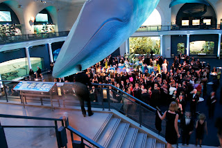
An event Lindsey planned at the Natural History Museum for Conde Nast Traveler, NYC
A Caribbean fiesta Lindsey planned in the Bahamas for Traveler
ELLE Decor's inaugural "Women in Design" which Lindsey planned in NYC

Yummy hors d'oeuvres!

Monday, November 15, 2010

Display your products using an Ikea box and decorative paper!

My invitation display created with decorative paper and Ikea boxes. ©margot madison

I've had some great opportunities to present my invitations at various bridal events this past week. It has been a few months since I've done that and I thought it time to redesign my table-top presentation. I used to do ribbon boards, but I was getting tired of bringing a huge easel to hold them up and the boards themselves were getting pretty battered too. I remembered how useful stacking boxes were when I did retail displays at my storefront, and decided that was the best direction for me. But as many of you crafters know, YOU are the one lugging the display and all its contents through parking lots, across streets and up stairwells to the event. A large display is rather difficult in those settings, so I set out to find some smaller square boxes that I could stack in a variety of ways to get some height to the table, but also add some color and organization too.

So I zoomed through Ikea and discovered this perfect box on the second pass, hiding in the office organization section. They are a new size and made of lightweight and light colored balsa wood (again, don't quote me on the wood specifics!) and this particular product did not include a lid, which was fine and the price was amazing--only $6.99 each! I raced home to my studio and set to work on making them "mine". While I was getting my supplies together, I thought, "Hey! This is a perfect DIY for the blog!" And so this post was born...

Supplies:
Ikea Prant Box

X-Acto knife
cutting mat
spray adhesive (I use 3M Super 77)
Hammer (to assemble box)
Decorative paper at least 12 x 12" in dimension (I sell these particular papers and more on my Snips & Scraps etsy store)


The box comes disassembled of course, which makes this project even easier to do.
1.) Measured and trim the decorative paper to 12 x 12"--and how awesome that you can skip this step if you purchased scrapbooking paper already cut to this size!
2.) Spray the back piece of the box with adhesive. Note: I do not suggest decoupage for this.
3.) Affix the paper to it.
4.) & 5.) Trim the excess paper from the edges with your knife
 6.) Assemble the 3 sides of the box. Be careful to match the grooves up on the bottom. It is surprising difficult to remember that when doing this. Or maybe just difficult for me.... ;o) LOL etc.
7.) Slide the back into the grooves and bang on the last side of the box. THAT'S IT! I think the whole project took (including some re-assembling) about 15 minutes total.

Saturday, November 13, 2010

Winter Wedding treasury featuring my Birch Trees Save the Date

This is fun! Lots of wedding inspiration included in this Winter Wooded Wedding:
 Thanks for including my cards!

Friday, November 12, 2010

A fall bouquet with leaves and berries from my street

An arangement of fall flowers and leaves from Margot Madison

I must talk a lot about how beautiful the color of fall leaves are in my family because my 5 year old son Oliver decided that he would "gift" me a collection of them every time he came home from the bus. It's adorable and sweet and it's true that each one is just as beautiful as the last. We have a pear tree (don't quote me on that, it's been a long time since the leaf collection in 9th grade biology class) down the street that seemed to produce the most glorious red colors this year. The leaves have a smooth waxy feel and their shape is a pretty little heart. My favorite this fall!

Last weekend I decided to try my hand at creating a fall bouquet. Of course my theme colors were (don't groan!) pink and gold which translated into deep red leaves, light peachy-pink roses and golden orange berries (which I also swiped from the trees on my street care of my tall husband). I think they were crab apples. Again, don't quote me on that. Oliver and I did the collecting of leaves together with dad experimenting with his iPhone movie camera feature. It was a family affair to be sure.

My sister and I have a running joke about how bad we are at flower arranging, so please understand that this is a learning project for me. Floral arranging, like photography takes a lot of practice and skill but I want to be better since I usually don't have a budget for the professionals, awesome as they are.


Anyway, I used thin 6" skewers (left over from my "Scary Skewer" halloween project) and gathered about 6 leaves into a mini bouquet and wired them onto the skewers. I made about maybe 12 of these and put them in a 6" by 4" tall glass cylinder vase. Then I added the roses and berries and the decorative paper to the outside of the vase. I made some additional smaller arrangements in some silver patterned votives from Crate & Barrel with grass fronds from my garden. Overall the arrangement cost me $6 for the roses (on sale at Kroger) and an additional $8 for the votives but I don't count those. ;o)

And on the photography end of things (one of my resolutions this year was to improve my photos) I think I may have figured out the "Effing F-stop" issue I've been having. More on that later...

Thursday, November 11, 2010

Make a cute favor label the cheaters way...


Well, not cheating really. Those of us who are designers feel a moral obligation to come up with something totally original for everything we do. Or we feel like we have to design the bejeezus out of every surface of our event. That motivation certainly keeps me inspired but are there times when you should take it easy a little? Here is a great idea from Victoria at City Cradle. She used simple notecards from the dollar section to embellish these adorable treat boxes. The colors are right, the pattern is right and it works perfectly with the styled event. By the way, you should also take a look at this entire post on a "Playdate by the sea". It's amazing. I can't even find the time to make a phone call for a playdate much less create a scene like this one, but I say that with all due respect and no bitterness at all. Every moment is one we can style and take care of isn't it? I admire that good stuff.

Back to this label concept. So, who's to say you can't do this with some cool wrapping paper you've got on hand? This would work for your wedding favors too or a simple hand made card for a friend. If you like the image, then use it! Don't get caught up in the personalization of it. Even though there is nothing wrong with personalizing things like this, sometimes it's refreshing to NOT have your monogram plastered all over everything. Use this chance to bring in a pop of color or a change of pace like using a more quirky design in an austere setting. This isn't cheating, you're just not reinventing the wheel if you don't have to. Keep your eyes open and your design sense loose and you just might find a gem in that dollar bin...

Wednesday, November 10, 2010

Bridal Expo and Fashion Show at the Cincinnati Art Museum

Cincinnati Art Museum Bridal Gown Exhibition

I mentioned a while back about the Cincinnati Art Museum having a great exhibition on bridal gowns called "Wedded Perfection: Two Centuries of Wedding Gowns" which runs from October 9th, 2010 through January 30th, 2011. I can't wait to see all the dresses and my goodness, what a skinny waistline this chick must have had, yikes!

Mark your calendars because there will be a fashion show and expo on Wednesday, November 10th from 6-9 pm with light hors d'oeuvres (Okay, a small interjection here: it took 3 tries to spell that word correctly! When will we stop using that word in America?? Anyway...) and a cash bar etc. I'll be there with my invitation samples and would love to meet you in person and answer any questions you may have on you invitations etc. I think it's going to be good fun so bring a friend and come along! And hey, it's FREE so you can't beat that, right?

Tuesday, November 9, 2010

If you're a bride, you should go to Saks on Saturday!


Saks is having a really fun bridal event with prizes and swanky giveaways. Get you're bridal posse together and head to the gorgeous downtown store from 2 until 4 this Saturday, November 13th. There will also be a trend presentation at 2:30. I'll be there with my invitations and a special gift for you as well. For more information and to RSVP call Lindsey at 421-6800, ext 205.

Monday, November 8, 2010

Napkin No-no's

Funny, I hadn't thought about this until I was reading Brilliant Event Planning's blogpost on what not to do with your napkins. Truly, nothing says "stuffy old people restaurant" like a fan-folded napkin in the water cup. And now this gets me off the hook on learning the fine art of fan folding napkins. See those chairs in the top left photo? Those just say it all, don't they? Read up on the better approach to napkins here. Hint: KISS--keep it simple, sister!

Friday, November 5, 2010

My Snowflake Save the Date featured in this snowy treasury

Bring on winter! The Margot Madison Snowflake Border Holiday Photocard was featured among these other snowy etsy items. I like that embroidery and those wood coasters are pretty cool!

Thursday, November 4, 2010

Holiday Save The Date Cards from Margot Madison Creative

Here's a little smattering of save the date cards I have for sale at my etsy store. Of course you could use any of the holiday cards to do the same thing too, but these are especially cute and can be specific to you and your betrothed. I love the birch tree carving one because you can have your initials "carved" into the tree. I'm going to be giving away 50 cards to one lucky winner in the Fab Friday Giveaway on BridesBuddy.com this Friday. But don't worry, if you miss out I'm offering 25 cards free with every order this year. I'm feeling loving with all this wedding stuff ;o)

Wednesday, November 3, 2010

A Christmas Card for those who don't have a great picture of everyone

A holiday card from Margot Madison Creative that is personalized.

I think this is going to be my family Christmas card. It is  nearly impossible to catch everyone in my family looking good, eyelids not half closed or not shouting at someone else in the photo to look up and smile. If you have more than one child, then you know what I mean. This one allows me to choose the best from the past year and use those. It takes the photo pressure off. These and more of my customizable holiday card designs are available in my Margot Madison Creative etsy store.

I also like to add something personal to the card that gives friends and family a smile and lets them in on a glimpse of our life as it is this year. I started thinking about how the gifts the kids request from "Santa" capture where they are right now, as well as a little bit of their personality. Oliver (5 years) wants Legos, Natalie (7 years) wants an old-fashioned phone to go in her office (a separated handle somehow seem more official to her, which I think is so cute) and Julia (10 years) wants an iPhone, which she won't get until she's several years older, but it she certainly is optimistic. These seem so obvious at this point, but I know that years from now when Oliver wants the newest version of a high tech computer game we'll enjoy remembering that when he was 5 he was happy with a few Lego spaceships.

Are you making your holiday cards personal this year? Tell me how!

Monday, November 1, 2010

The designs behind my invitations-a quick look at how I get to the final product

I think a lot about the creative process. I've discovered that essentially all artistic creations are really so similar, it's only the actual product that is different. It's basically filling space with textures, layers, colors, tones and feelings. In music, the layers and textures are designed with sounds, interior designers fill a room the layers and textures of furniture, wall colors etc, in food it's with taste and aromas, in visual art it's something you can see or touch, in literature you're creating with words. You know what I mean?

I wish that I could be so good at all the "arts" but I'm really not. I admire it all, though, and make a point to see how the artist got to the finished product. Where are the layers and textures, the colors and tones. How did they fill the "space" to make me like it (or dislike it!). I would like to see the process behind a song. I'd like to start from the milisecond of the sound in the songwriter's head, to the jotted down phrase in a journal, all the way through the knitting together, pulling apart and editing until the final product is complete. I'd also love to see an interior designer do it since I'm severely 3-Dimensionally challenged.

So if this interests you, I have opened up my design brain with the help of my computer and displayed the many invitation incarnations I go through before I'm finally finished. Truthfully, I didn't show the really crappy stuff and on this particular one and I didn't do any type revisions since I was fine with what my head put in first. But that is often another 20 rounds with text and font combinations.

Here is the short visual tour:

If you are so inclined and have the time, please share your process! I would be so interested in how you get to your final masterpiece (warts and all!).

How do you make a corporate holiday invitation anything but corporate?

Aren't corporate holiday party invitations difficult? They have to be festive but not too silly or frivolous, can't bring any religious holiday icons or colors into it, and you're left with...a snowflake...and some blue.

Happily, my clients over at St. E Anderson in Cincinnati, OH and I were able to come up with something that looks classy, festive and definitely not blue and snowflake. I used the inkless letterpress technique where the paper is essentially debossed with the snowflake pattern and we used a fresh willow green for the text. I think it turned out really nicely!
Corporate Holiday invitation by Margot Madison Creative

Pin Me!

LinkWithin

Related Posts with Thumbnails