Remember my obsession with pink and gold? I haven't! This was the color chart I did a few weeks ago:
And look what I found on the Twig and Thistle blog!! Isn't this spectacular? It is a shower Kathleen threw for her sister (lucky sista). Here are some of the details to entice you but there are so many more, plus the invitation on her blog. I love the quiz cards with the gold pencil and that beautifully feminine cake. I'm absorbing it into my brain and the wheels continue to turn...and turn...(actually, they never really stop turning). If you stick around to the bottom of the post, I'll do some of my event psychoanalysis.... because what is a conversation with me worth if we don't over analyze it?
Here is my confession and lead-in to the Event Analysis: One of the reasons I love to look at existing events is because I have always really struggled to design spaces (including my poor house). One of my goals is to break down the parts but also to see the whole piece and how those little parts fit into it. So to analyze the success of this shower further, I'm thinking about that color chart I made. I've seen other color schemes where the colors at the bottom are given equal status. I think a really beautifully balanced color scheme is all about the proportion of color, isn't it? I've spent a great deal of energy in my adult life resisting the urge to include ALL the colors in ALL the pieces in an event design: the tablecloth that has all the colors in it, and the flower arrangement that has all the colors in it etc. For me, that's a recipe for visual chaos and ultimate disappointment. I'm learning to look at the entire space as the color palette. So maybe the table linen is the base color, like that blush pink up in the color bar, then the table arrangement would have lots of golds, a few medium pinks and then a hit of the dark. Or maybe just golds and the napkins in pink. See how that cake worked in the shower? Light pink with the flower decoration as just a "pop of color"; in the same hue but darker and more dynamic. And when I really look at it, the dark wood of the table even goes along with the theme. That Kathleen, she's a good one! What do you think? For those who design events and interiors, how do you do it?
Friday, October 29, 2010
Thursday, October 28, 2010
You must look at every detail in this handmade wedding...
It is simply absolutely gorgeous and utterly inspirational! It stars Melissa from Design Box blog, and she shows and shares every detail from the ceremony bouquet to the reception!
Here is a little just to tease you but you will definitely visit her blog post to get all the little bits.
Wednesday, October 27, 2010
Clever Halloween Costume for $1
![]() |
| Digital art for a fun pirate themed costume from Margot Madison Creative |
Here's how my mom and dad are doing the costume. Dad is wearing some miscellaneous pirate gear and the "Yo! Ho! Ho!" on his shirt. Mom is dressing in a brown pillowcase with a hole cut out of the sewn short side with the "Bottle of Rum" decal on her front, some brown leggings and is making a gold pill-style "cap" hat out of cardboard.
HERE'S WHAT YOU CAN DO WITH IT:
1. You can print it on cardboard and pin it to yourself. Size the print about 8x11" so it will fit comfortably on your shirt without curling over on the sides too much.
2. You can contact your local sign or print-making shop and have them print it for you on adhesive vinyl so you can stick it to your shirt.
3. You can print it to a t-shirt decal paper and iron it on your shirt.
Now, go have some fun this weekend!
Tuesday, October 26, 2010
DIY Demystified-What to say on your REPLY CARD
Reply cards are a modern invention. Originally, after receiving a hand written invitation, you would obligingly pull out your lovely writing stationery and send a cordial reply stating that you would be indeed attending the event. But as we careen further into a casual non-response world, the reply card was born essentially saying: “Dearest guest, PLEASE PLEASE PLEASE tell us if we need to set a place at the table for you and your lovely friend.”
By the way, R.S.V.P. is a short cut to the french phrase “Répondez, s’il vous plait” which, translated into English means “Please respond”. So you don’t need to say “RSVP please” as it sounds a little desperate, you know?
Just send a simple card with the phrase “Please reply by the 0 of Month”. I love this style and optimistically think that my friends would know what to do. They are supposed to write something like, “John and I look forward to attending your wedding. Sincerely, Jane Doe”. Unfortunately, most people don’t know what to do with that blank space and ignore it, leaving many brides in a panic because they have no idea if their fiancé’s frat brother is coming at all, much less with a date.
IF YOU WANT TO BE SURE YOU'LL GET SOME RESPONSES DO IT THIS WAY:
Most hosts include the reply address and pre-stamp the envelope to further encourage responses. You can also number your guest list and lightly pencil the guest’s corresponding number on the back of the reply so that if their handwriting is as illegible as my husband’s you can still have a chance of knowing who sent the reply. I’ve also heard of people forgetting to put their names on it at all, which is totally something I would do by mistake. This covers that scenario too.
INTRODUCTARY PHRASES:
Please reply by Month 00.
Kindly reply by the 00th of Month
RSVP by Month 00
We look forward to celebrating with you, kindly reply by Month 00.
GETTING YOUR GUESTS TO TELL YOU WHO THEY ARE:
________________ name(s) (I usually put the name part under the line)
*I do not like to use the “M” before the line. A pre-written “M” makes me feel like my host thinks I’m an idiot, and I don’t like how it looks when I write my name in. And lots of guests are Doctors, which doesn’t fit the “M” standard, right? Let’s eliminate this from our wedding standards, shall we?
THE “ACCEPTS/REGRETS” PART:
_____ accepts with pleasure _____ declines with regret
_____ will attend/_____ number of guests attending ____ unable to attend
_____ gratefully accepts ______graciously declines
will______attend (guests write “not” if applicable, or leave it if they are attending)
_______ looking forward to the celebration _______ sorry to miss the fun
If you’re concerned that even though you did not write that your friend could bring a guest, or their child etc, they might just bring one. You can use these options in which there is a great hint that they are or are NOT allowed to bring someone else with them:
______ of ______ guests attending (host fills in second line for them)
we have reserved _______seats in your honor (again, the host fills in the line)
SPECIAL REQUESTS
If you have dinner choices, position them under the “accepts” phrase:
Please indicate your meal choice here (beef or chicken):___________
_______ beef _______chicken
Please indicate any dietary restrictions __________________
Please initial your meal choices here ________beef ________chicken
Some brides have been asking for song requests, which I think is cute. You can put that at the bottom of the reply.
You may include any other parties (like rehearsal dinner, cocktails, brunches, gold games etc) in the reply card as well. Just remember that you mustn’t do this if your guest is not invited to that party. That would be awkward for everyone, wouldn’t it?
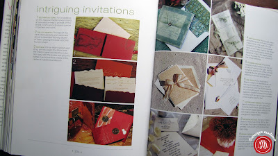
REPLY CARD AND ENVELOPE OR REPLY POSTCARD?
I’d say that 97 percent of my clients are going toward the postcard option. It’s less paper (keeping it green and less bulky), less printing (budget friendly), and less postage. It can look every bit as formal as you need it to and remember that it doesn’t stay with the invitation so this is the place to cut costs if you need to. The size should be no smaller than 5 x 3.5” and no larger than 6.25 x 4.25” for the postal requirements on postcard stamps. The reply address can go on the same side as the reply information or it can be printed on the back of the card. I’ve had a few more well-known clients who preferred to keep things private for obvious reasons and choose to keep the envelope option. Also, the reply envelope is the most traditional and some brides just like to keep it that way. No problems either way, now you know your options!
WHOSE ADDRESS DO I USE FOR THE REPLY?
Traditionally, it is the bride’s parents requesting the information because they are the ones giving the party. But of course modern times are changing everything. Brides and grooms and anyone in between can receive the responses so my question to you is: Who is the most responsible party to record this very important information? If you are getting your doctorate and cannot manage the responses, then send them to your parents. If you are moving and won’t have a reliable forwarding address then send them to your parents/fiancé/friend. If you want to be in charge of the responses, then send them to yourself. This is really more of a practical issue than an etiquette one.
HOW DO I CHOOSE THE “REPLY BY” DATE?
This is usually determined by both you and your caterer. Usually caterers require 2 weeks before the party for the final numbers. You might want to give yourself a week before that to make any calls to those who have not responded at all and to collect your final list. Some brides require special timing for destination weddings and that should be taken into consideration. All in all, some people still won’t pay a speck of attention to the date and you’ll have to call them anyway. Expect this and give yourself some leeway for it so you stress less.
WHAT IF I WANT TO DO SOMETHING TOTALLY DIFFERENT?
You should do it! Adding your personal touch makes it fun for your guests. I’ve seen some hilarious puns, or language that relates to the spirit or theme of the event. As long as you are getting the information you need, you are free to be creative!
Monday, October 25, 2010
The world of digital art
Happy Monday creative friends. Today my internet travels took me on a journey through the digital art world and it was quite an interesting trip! I started at the on-line store called My Grafico where they sell digital art collections by various designers. I haven't yet purchased one of these, so I'll start with that disclaimer, but it looks like a great idea for graphic designers and computer savvy crafters and party planners. You essentially purchase the digital art and receive it as a file (most companies let you choose JPG, PDF, PNG etc). You can use on your invitations or miscellaneous party items like favors, cupcake toppers, stickers etc. And what about bake sale decorations? Or christmas cards and tags? Make sure to read the user agreement from each vendor and be sure you are using these according to their licensing specifications. Nobody wants to get screwed here, right? Right.
I'm impressed with the variety I saw in the hour or so I spent researching this stuff. I saw everything from vintage flowers to Michael Jackson. Lots of items could be used in elegant wedding invitations, charming children's parties, or baby showers. Of course, you wouldn't use Michael Jackson on that, but I got those creative juices flowing, didn't I? ;o) This is a small sample of what I found on etsy:
Here are some cute cupcakes from Todd Design. I still have cupcakes on the mind ever since Meredith's cupcake party.
Here are some sugar skulls from ArtVision. I don't get the whole skull thing I must admit, but I do love to look at them. The designs are so cool!
Some elegant vintage labels from Vivian Artwork. I've seen this theme trending in wedding invitations.
Some adorable space monsters from Woofy World. So cute for a boy birthday party!
Some cute cars from Scotty Girl. I must be subconsciously planning my son's next birthday.
Some sweet little snowmen from Peach Pops Clipart.
I love these scallop borders from Ginger World. You could put a monogram, name, or address in there and snap! A great wedding logo or custom stamp artwork.
And it's not just digital illustration that's out there. I love, love, love these "fabric" banners and flowers from Lemon Tree Studio.
What do you think of this stuff? Could you use it in your next event? Have you had some success using it already? Tell me all... And have a great week!
Thursday, October 21, 2010
DIY Demystified-Things Things That Cut: Using the rotary trimmer
My rotary trimmer and I go back a long way; we've had some good times and some tough times but I wouldn't trade it for the world. This is the most frequently used tool in my arsenal of "Things That Cut" and I'm happy to share my 15+ years of experience in this short video tutorial. Even if this seems like a no-brainer for you crafty folks, I included some tips specific to invitations that I learned even this year. It's the first in the series, and don't worry Katie Couric, I'm not quitting my day job. ;o)
I use the rotary trimmer a lot in my studio. It’s good for cardstock and paperstock, makes fairly precise measurements and is easy and quick for projects with 100 pieces or less. There is a base or platform with standard inch and centimeter measurements at the top, with some handy guides throughout.
The blades are held in place here and as you can see are very easy to switch out. I use the straight cut blade the most, obviously, but there are other good options available like a scoring “blade” that will make a crease where you intend to fold and that reduces the cracking that can happen on cardstock, a perforating blade if you want to do a tear away piece on your invitation, and some decorative edges like a scallop or ricrac cut.
You can trim paper and cardstock of course. I’ve had some marginal results with translucent vellum. Sometimes that’s better done on a professional electric trimmer that you find at print or office shops like Kinkos. Start by lifting the cutting bar and position your cardstock along the top edge at your measurement. Now after about 10 years of using these, I didn’t discover until this year that you should cover the actual line of the measurement you want. I never knew if you were supposed to split the difference or go up to but not over the line etc. That’s why I said this tool is fairly precise. There’s always room for human nature here.
After your cardstock is in place, hold it firmly with your left hand, drop the cutting bar down and make one swift and firm movement from the bottom to the top. Then lift the bar, shift the cardstock to the next measurement and make another cut. This is a backing or reveal for a 5x7” invitation, so the final trim size is 5 x 7”
When you are designing your invitations, remember that you can fit 2 to 4 or more copies on one page and reduce your paper waste, make fewer cuts and print fewer pages. You can see that I’ve done that here. There are two invitations on this page, I haven’t used any crop marks because I know what the measurements are. For a 1/8” reveal or border, I’ve designed the invitation part to be 4 ¾ x 6 ¾.
For some people, they have what I call a waverly line and that comes from pressing toward your body when making that cut. If that’s happening, just be conscious of even pressure from the bottom to the top.
If you didn’t get a clean cut, you can reposition it and trim again. You can’t do this if you are using a decorative or perforated edge because the cuts won’t line up perfectly with the last ones and you’ll have something that looks like your trimmed it with your teeth.
As you move through your project, you may notice that the trimmed edges are getting fuzzy. This can be quickly remedied by rotating your cutting bar here. Just lift it out and switch sides. You can do this twice on each of the 4 sides. These cost about $15 to replace and you can get them at craft stores where they sell the rotary trimmers.
Hope that was helpful for you! It does take some people more practice than others but I think you’ll find this a good tool to have around! As usual, if you need more tutorials or have any questions or need event inspiration just visit my blogsite at margotmadisoncreative.com!
Another great wedding song
This comes via Kisa Koenig's website. It's called Time Enough for Rocking When We’re Old by The Magnetic Fields
It's a great little romantic number that'll bring a few tears to your eyes. Have a listen...
Wednesday, October 20, 2010
La-la-la Luminaries
I was thinking about luminaries today and thought you might be thinking about them too. Are you having an evening event or wedding? I read in one of Colin Cowie's entertaining books that putting lighting on a surface drew guests to it without fail. I tested it at one of my parent's parties and it was so true! We added some to an out-of-the-way drink station and it worked like a charm. That Colin knows his stuff, doesn't he?
So I gathered a few luminary ideas for you. I even numbered them so you can find their creative sources more easily. Smart, eh? ;o)
1. Origami Luminaries made from watercolor paper. Pretty amazing! from Green Baboon Designs.
2. Hydrangea flower "lumies" from Illumienate...I know these are so popular since hydrangeas are such a fabulous wedding flower!
3. Sweet and homespun for your backyard aesthetic. This is a DIY kit from Midwest Finds.
4. Great use of a simple burlap fabric on these votives from Lush Designs. It's kind of modern in it's simplicity and oldschool at the same time...my favorite combination!
5. Butterfly cut-out luminaries from Dolce Caramella for a gentle summer evening.
6. Love this modern line of custom luminaries from Paper Acorn (from my hometown Cincinnati, of all places!). How great would these look at the Head Table at the reception, or around the dessert table? Put them on a second tier so that people wouldn't accidentally bump their crisp line.
7. A simple monogram from A Wild Designs is always a classic.
8. Great use of doilies (at least I think that's what they are!) to add a touch of dainty. Brought to you by My Haley Girl.
9. I think I still have some cans filled with frozen water in my freezer still because I was so determined to do this project with my kids. It's so easy (and let's face it, cheap) that you should try it. I love how these are painted inside too. Nice detail. Find the instructions on Factory direct Craft Blog.
And since you made it all the way to the end of this post, I'll delight you with this guy's mug. He showed up when I had googled "Luminaries". He sure looks like he's trying to bring light into this world, doesn't he? Ah, we shared a good laugh together despite it all. I think I need to get out of the studio today...
So I gathered a few luminary ideas for you. I even numbered them so you can find their creative sources more easily. Smart, eh? ;o)
![]() |
| A collection on luminary ideas from Margot Madison Creative |
2. Hydrangea flower "lumies" from Illumienate...I know these are so popular since hydrangeas are such a fabulous wedding flower!
3. Sweet and homespun for your backyard aesthetic. This is a DIY kit from Midwest Finds.
4. Great use of a simple burlap fabric on these votives from Lush Designs. It's kind of modern in it's simplicity and oldschool at the same time...my favorite combination!
5. Butterfly cut-out luminaries from Dolce Caramella for a gentle summer evening.
6. Love this modern line of custom luminaries from Paper Acorn (from my hometown Cincinnati, of all places!). How great would these look at the Head Table at the reception, or around the dessert table? Put them on a second tier so that people wouldn't accidentally bump their crisp line.
7. A simple monogram from A Wild Designs is always a classic.
8. Great use of doilies (at least I think that's what they are!) to add a touch of dainty. Brought to you by My Haley Girl.
9. I think I still have some cans filled with frozen water in my freezer still because I was so determined to do this project with my kids. It's so easy (and let's face it, cheap) that you should try it. I love how these are painted inside too. Nice detail. Find the instructions on Factory direct Craft Blog.
And since you made it all the way to the end of this post, I'll delight you with this guy's mug. He showed up when I had googled "Luminaries". He sure looks like he's trying to bring light into this world, doesn't he? Ah, we shared a good laugh together despite it all. I think I need to get out of the studio today...
Monday, October 18, 2010
Blush and Gold Challenge, phase 2
Continuing on with my color challenge obsession with blush and gold, I did some web trolling to find some inspiration and products that would turn these colors into a beautifully styled event. My goal is to use these colors in a more modern and edgy way, combining textures and graphic shapes to give it a less frilly persona but still hold on to it's very beautiful and feminine nature.
Here is what I found: I absolutely love this Vintage German Gold Dresden paper trim from Gathering Splendor and already purchased it, and the autumn mums in this arrangement from It's Pretty Light were what I had in mind for a floral arrangement. I was also thinking that berries would be a nice graphic element, or richly colored burgundy leaves still on branches. I also love the idea of the wheat stacks to add some architecture to the table and I would bring a touch of the pink in the stack with that pink and gold braided trim on the bottom right corner from Onlyee. Of course coffee flavored caramels from Fusion Sweets bring in a touch of golden brown, gold cupcake liners from Cupcake Social with blush pink frosting on the cupcakes, the cameo ring from Tamar and the fabric from Fabric Worm show the delicacy of the colorscheme and include graphic element I was hoping for. The table runner from Dining Out is a good idea too. I thought that even some butcher paper on a table with loose gold swashes painted on it would be fun and very inexpensive. The wheels are turning for the invitation and paper accessories that would complete the look. More on that later...
If you didn't catch it, here is where the obsession started when I did a color palette for this beautiful photograph last week:
Friday, October 15, 2010
Child's play
![]() |
| A "masterpiece" from my 4 year old niece. |
I've been "allowing" my kids to use my purse sketchbook in times of great need (ie. when the screaming gets so bad that I start losing my voice). It is so immediately soothing and quieting to get everything onto the page. And I get to enjoy little view into their minds.
I love to watch kids color and draw. It is utterly fascinating to see how they choose colors, make shapes, patterns, people, scenes, stories and more. Each is a masterpiece of the moment. They are each as different as the person, and even though this should really not come as a surprise, it just well, it amazes me.
My niece Meredith was over the other day while my sister was running some errands. Looking quickly for something age appropriately entertaining, I discovered a little lined notebook in the Craft Cupboard that fit the bill because 1.) it was small and 2.) looked important with all the lined paper. Her eyes lit up, she smiled and said in her 40-year-old woman voice, "Yes, I think I would like to color in that." --As if she was ordering dinner off a menu. She wasn't fooling Auntie Margot, though. She wanted it bad.
And so she created a variety of wonderful pieces, each given to me in a formal presentation. This one is my absolute favorite. Look at the careful circles and rich colors! I love the concentric circles in the center that are so perfectly balanced with the smaller ones, and with the rest of the page too. How did she decide that or is it so intuitive that she just did what felt good? This is just a wonderful reminder to enjoy pure creative endeavors in everything you do and see.
Have you seen something amazing in your own children's art? I invite you to share them with me...
Have a great weekend! I'm going to be camping with my family in eastern Ohio. I'm bringing the watercolors and have promised the kids that they will be able to use them with me.
Thursday, October 14, 2010
Can Blush Pink and Gold be modern too?
We'll see. Despite the fact that I should be cranking out some holiday color right now, this is the color combination that has been taking up residency in my brain the last few nights. I love the soft tender feel of blush pink. It's so feminine! It is so often thought of as a baby or frilly color or old fashioned or vintage (and there is nothing wrong with that!) but I'm not sure it has to. I think it can have a new persona if combined with some more edgy and bold colors like black coffee, deep lipstick pink, wheat and ochre.
Anyone have examples of blush pink with an edgy side? I'd love to see them as I work through this color challenge. And I've included the CMYK and RGB color breakdowns in the image just in case you're wondering or needing them.
Photo from Crivvens.
Stay tuned!
Wednesday, October 13, 2010
Scary Skewers! A fun little halloween project...
We're fans of the sculpting clay at the Madison house. We keep a nice and messy ziploc bag of it in the Craft Cupboard for random crafting occasions. It's messy because we save every little dot, no matter how mixed up it got when creating the previous project. You never know when you're going to need that little dot to make an eyeball or something...
Speaking of eyeballs, this was a little project I did with my 10 year old daughter (and crafting maniac) Julia with clay and thin wooden skewers. I wanted to do skewers because we are big bento box lunchers and I thought it would be fun to have a skewer of eyeball grapes and other disgusting lunch food for Halloween week. I haven't told her this part so unless she gets off the Webkinz site and reads this, then my secret is still safe. I think I'm pretty safe.
We spent about 45 minutes thinking of ghoulish halloween things and molding them from the clay. My husband even joined in; his is the alien. My creepy spider with fangs and black widow markings had his legs fall off so he didn't make the photoshoot cut. We couldn't for the life of us figure out how to make a bat. What else do you think would work? A skull? A vampire? Some kind of severed limb?
CRAFTING NOTES: Make the object fat so it fits on the skewer securely. Before you bake the clay creations, push the blunt end of the skewer in so the hole will remain after it's hardened. Then when they cool from the oven, fill the hole with some tacky glue and insert the skewer. Leave them to dry and you're all set. And in case there are some neurotic mothers out there--you know who you are because you gasped at the thought of me sending a potentially dangerous sharp stick in my kids lunch box, I'm going to snip the sharpness off the skewer before I send it to school. Don't worry.....
Tuesday, October 12, 2010
Fall Color Inspiration, Glenwood Gardens Style
I thought I would try to translate the colors I saw in the Glenwood Gardens photo I posted here, into a wedding event inspiration collage.
Credits are as follows (starting from the top left):
Colorful Bowls from Retroburgh, Headband from Leather Blossoms, Hot Chocolate Favors from Beau Coup, Japanese Washi Tape from Happy Tape, Fall Bouquet from The Loveliest Day, Invitation from Stelie Designs, Bridesmaids from Blog Cleveland, Toddler Ties from Baby By Stevie, and Yellow Ranuncula from Hairbows Wonder World.
Monday, October 11, 2010
Have you ever tried watercolor? You should!
Do you ever feel like you are desperate to do something creative but don't have the time/effort/money/correct supplies/energy? I felt like that for several years (the ones I refer to as my dark years) and I vowed this year to change that. I've started picking a project--anything creative--and getting together with friends of like-minded creativity to just sit down and do it. No pressure, no worries about the results, just focusing on the creative process and enjoying it. We bring supplies that we have so there is no real cost investment. This evening's creative attendants were Lindsay, a fellow graphic designer in a rather dull job at the moment, and Tammy, a fashion major secretly trying to run her kid's Waldorf school and I'm a graphic designer trying to find my creative talents away from the computer.
This weekend, we decided to do watercolor. For some reason, I've always been scared to death of it! In all the years at art school, I never took a class. I've seen such beautiful examples of it that I am totally intimidated. But, since the aforementioned promise to myself, I was willing to try. So we sat up to the table, opened the wine, shared a page between us and just let it go:
I am completely and totally in love with it and will be going to the art store post-haste to get some tubes of that liquid joy. I ditched that sly-talking "what's proper watercolor technique" voice in my head and just started doodling. And I drank wine and talked with good friends. I'll add here that the only time I got in trouble in school was for talking during art, so this part is a natural for me. We did some career counseling, Tammy didn't accidentally make a uterus, and we discussed our personal affections for punctuation (Lindsay with the elipses, me with my parenthesis--see I'm doing it right now!-- and I can't remember what Tammy's was). Good times, good times...
So, creative friends, what are you doing to stretch that creative rubber band in your life? Have you tried something new lately? Did you let your expectations go and just enjoy the act of creating?
This weekend, we decided to do watercolor. For some reason, I've always been scared to death of it! In all the years at art school, I never took a class. I've seen such beautiful examples of it that I am totally intimidated. But, since the aforementioned promise to myself, I was willing to try. So we sat up to the table, opened the wine, shared a page between us and just let it go:
![]() |
| Here we are at the start. We all brought some props just in case we needed some inspiration. |
![]() |
| 1 bottle of wine later... |
![]() |
| 2 bottles of wine and the finished results. Isn't it remarkable how different our styles are?? Those are my "doodles" on the left there. |
I am completely and totally in love with it and will be going to the art store post-haste to get some tubes of that liquid joy. I ditched that sly-talking "what's proper watercolor technique" voice in my head and just started doodling. And I drank wine and talked with good friends. I'll add here that the only time I got in trouble in school was for talking during art, so this part is a natural for me. We did some career counseling, Tammy didn't accidentally make a uterus, and we discussed our personal affections for punctuation (Lindsay with the elipses, me with my parenthesis--see I'm doing it right now!-- and I can't remember what Tammy's was). Good times, good times...
So, creative friends, what are you doing to stretch that creative rubber band in your life? Have you tried something new lately? Did you let your expectations go and just enjoy the act of creating?
Friday, October 8, 2010
Finding "true" fall colors and choosing wall paints...
![]() |
This color scale was an exercise I gave myself so that I practice "seeing". I also included the proportions of color as I saw it because that is also a part of the beauty in natures color palette. Not everything in equal measures...
I was thinking that this exercise might be good for wall paint choices. I painted the exterior of my house this summer and it took a good month of color samples to get anything close to what I had imagined in my brain would look good. The back of my house looked like a calico as I worked to find the right earthy gray and the right accent color (I explored burgundies, purples, ochres, greens). It was an amazing challenge for me to see the subtlety and complexity of colors once they are on a wall or large surface. How many times have I chosen a fresh green on the swatch, only to find it to be neon once on the walls! Too many. My artist friend Kimberly is a color expert (in my humble opinion) and her advice to me was always, "Choose the swatch that you like, then choose the grayer version of it." It's helped me out of many shocking wall colors, that's for sure!
So, you color masters and apprentices out there: How do you find the right color? What's your process?
Thursday, October 7, 2010
The invitations I designed in Colin Cowie's wedding books
Many of you have been asking about the work I did with Colin Cowie, and I thought it was time to do a quick show some of the designs that were featured in his wedding books "Extraordinary Weddings" and "Wedding Chic". I have thoroughly enjoyed working with Colin over the years as he is an amazing host with true elegant style--he's the real deal, not just a talker with a pretty face. I'll also say that I enjoy working with all my clients, whether they have a million dollar budget or not. ;o)
![]() |
| These are the 2 most recent books that have my invitation designs in them. |
![]() |
| This was for a garden wedding and used layers of papers, matte boards, engraving and more... |
![]() |
| This is the "Confirmation Booklet" for a wedding that took place in Capri. Lots of great die-cuts to mimic the coastline of Capri. |
![]() |
| The 3 on the left page and the top left on the right page are mine. |
![]() |
| These were menu booklets with the guest's names on so they did double duty as placecards too. |
![]() |
| This was the menu with the guest's name in the same gold as the signature medallion monogram. |
![]() |
| Host cards for the wedding had the gold medallion monogram and a die-cut detail. |
Wednesday, October 6, 2010
An invitation app that is ROCKING MY WORLD!
It's no secret that I love my iPhone almost as much as I love my husband and today it was an even tougher call.You know that twirly feeling you get when you see something totally awesome and can't wait another minute before you share it?? I HAVE THAT FEELING ABOUT THIS NEW APP called Post.
You can download it for only $.99 from the App store and get started right away. Choose background designs --I love the ones from Gadabout, add your text (you can adjust font size & alignment), determine your recipients and done! How perfect for my last minute art parties or "Come to drink on my porch" parties. Gotta go play some more...woohoo!
Vendor Spotlight at the Crafty Supermarket
I will rant for only a few minutes on the joys of the Crafty Supermarket that had it's humble beginnings in Northside in Cincinnati, OH. It is so spectacular and full of sometimes crazy, always clever and always unique crafts. It was so good that after the wild success of the first show, it had to move into a much larger place to accommodate all of us crazy-for-unique-crafts people. The next show is November 20 (just in time to start Christmas shopping, yes?) so mark your calendars.
On my daily web trolling for good stuff, I ran into Red Raven Studios from Pittsburgh, PA and saw that not only does Amy Lumsden have delicate and beautiful accessories, that she is coming to the Crafty Supermarket. Take a gander at these awesome belts (and keep in mind that I have a complete bias for birds...)
Beautiful! It almost makes me want to wear a belt. Or at least purchase one for my belt-wearing sistah.
Oh, and here are some earrings I liked too:
On my daily web trolling for good stuff, I ran into Red Raven Studios from Pittsburgh, PA and saw that not only does Amy Lumsden have delicate and beautiful accessories, that she is coming to the Crafty Supermarket. Take a gander at these awesome belts (and keep in mind that I have a complete bias for birds...)
![]() |
| Belt from Red Raven Studio |
![]() |
| Belt from Red Raven Studio |
![]() |
| Belt from Red Raven Studio |
Oh, and here are some earrings I liked too:
Tuesday, October 5, 2010
A Marie Claire gift...
Should you need any proof that the internet is the most amazing way to connect people then this is your story. A few weeks ago, I posted about my favorite style magazine from France called Marie Claire Idées. A few days later I received an email from a woman named Juli in NYC who was wondering what to do with her back issues of Marie Claire, and had seen my post on some google search she'd done. She asked if I would like them, and of course I said YES! I paid her for shipping and received this package on Saturday:
How darling of her to tie them with ric rac, which I thriftily stowed in my "Things that Bedazzle" drawer. It could not have found a better home on a better day! I had done my motherly duty by watching my daughter's soccer game in the freezing rain and was ready to curl up on my bed for some creative inspiration. So I spread the magazines around me, grabbed my sketchbook and spent a few hours coming up with new projects to start, and new blog entries to write. I'm so happy that Juli put forth the effort to ship them to me and I am quite thankful and much inspired. Don't be afraid to reach out to someone! It's the extra effort that counts in this world...
![]() |
| Juli's thoughtful package presentation! |
![]() |
| Back issues of Marie Claire Idées sent to me from a reader. |
Monday, October 4, 2010
The Crafty DIY Bride blog from Australia has some great ideas for you!
Arggg! There is such great creative stuff on the internet! I'm having another one of my crafty inspiration melt-downs (and it's only Monday!). I couldn't wait to start blogging today as it seems my brain is bursting with posts that I think you'd like. Well, one small step at a time....so I'll start here:
I like to keep my eyes outside of the US for crafty ideas. Not that there is anything wrong with the good old U, S of A but I find that there are some different aesthetics to european crafts and creatives. Ultimately, I think I like it because it's just different from what I see in American style magazines and blogs. And I'm likely to get some ideas that haven't been done a million times over, you know?
I want to introduce you to this wonderful blog from Australia called The Crafty DIY Bride. It is full of beautiful inspiration boards (and unusual--I love this sunrise/sunset color scheme) and craft ideas for your wedding or event. I sometimes forget that Australia has seasons opposite to ours, but really this is not a problem since most of us are planning the events at least 6 months in advance. Perfect timing for inspiration!
It is also part of a great Australian crafty collaborative effort called The Creative Collective where a few Australian bloggers encourage readers to create something and post the ideas to a flikr site for all to see and be inspired by. Awesome idea and I might contribute an idea of my own. Great to see such creative spirit out there! Who's in it with me? Share your creative ideas with the world!
Subscribe to:
Posts (Atom)


